A cathedral recognised by its silhouette
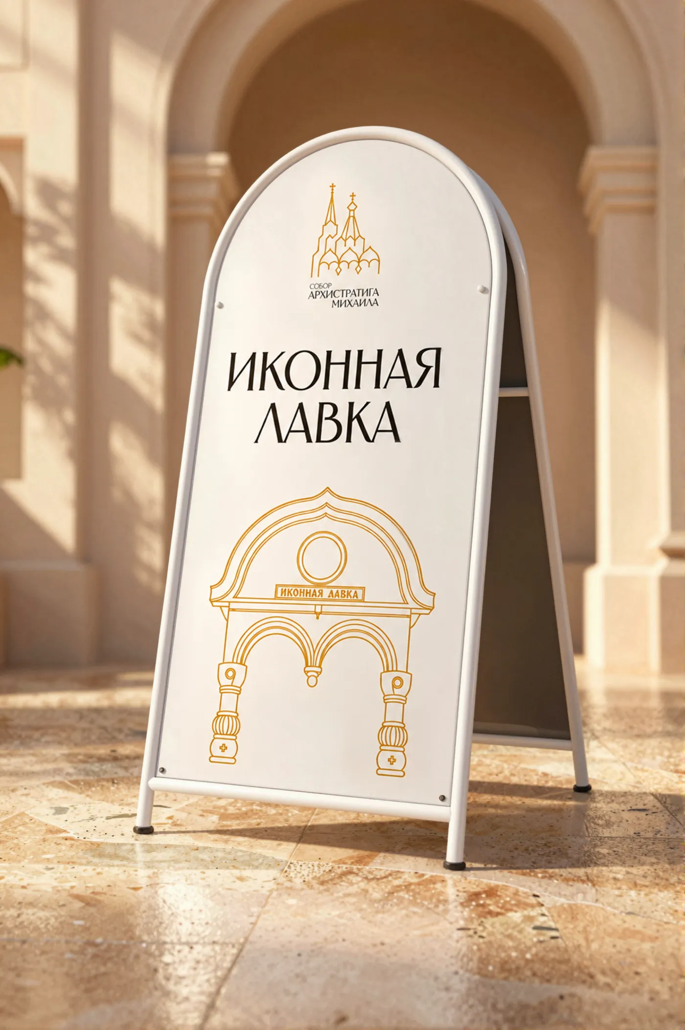
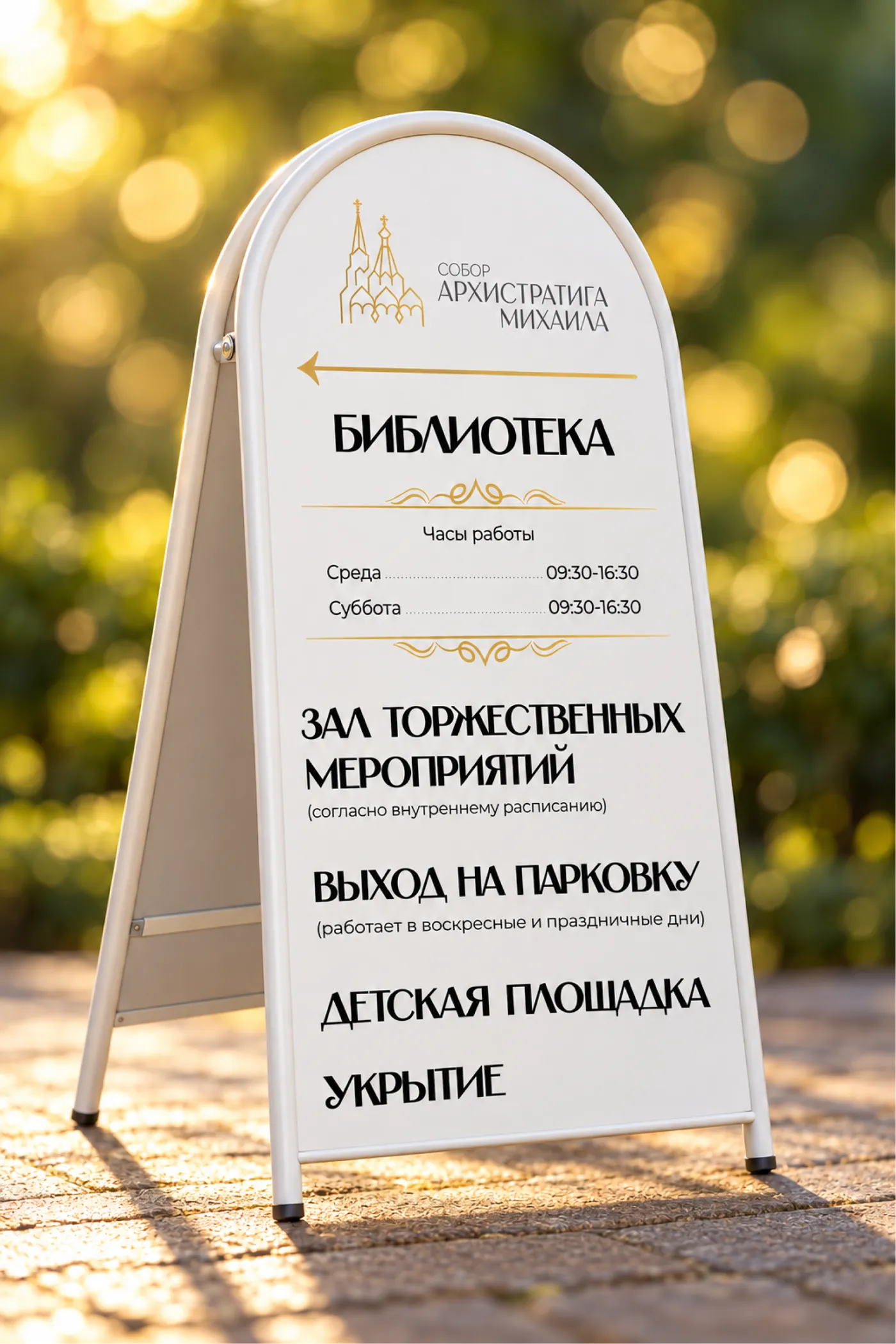
The visual identity of the Cathedral of Archangel Michael in Sochi: a fine gold mark tracing the real church and a “light and stone” system — from an avatar to parish signage.
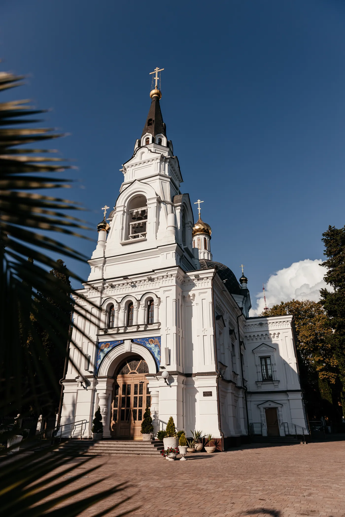
The Cathedral of Archangel Michael is the first Russian stone church on the eastern Black Sea coast: its site was chosen by Grand Duke Mikhail Nikolaevich, and it was founded in 1874. We needed a mark in which this particular cathedral is recognisable — not “a church in general” — calm, without tourist brightness or a decorative “Orthodox style”.
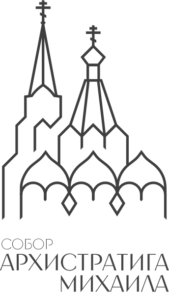
the outline of the real church
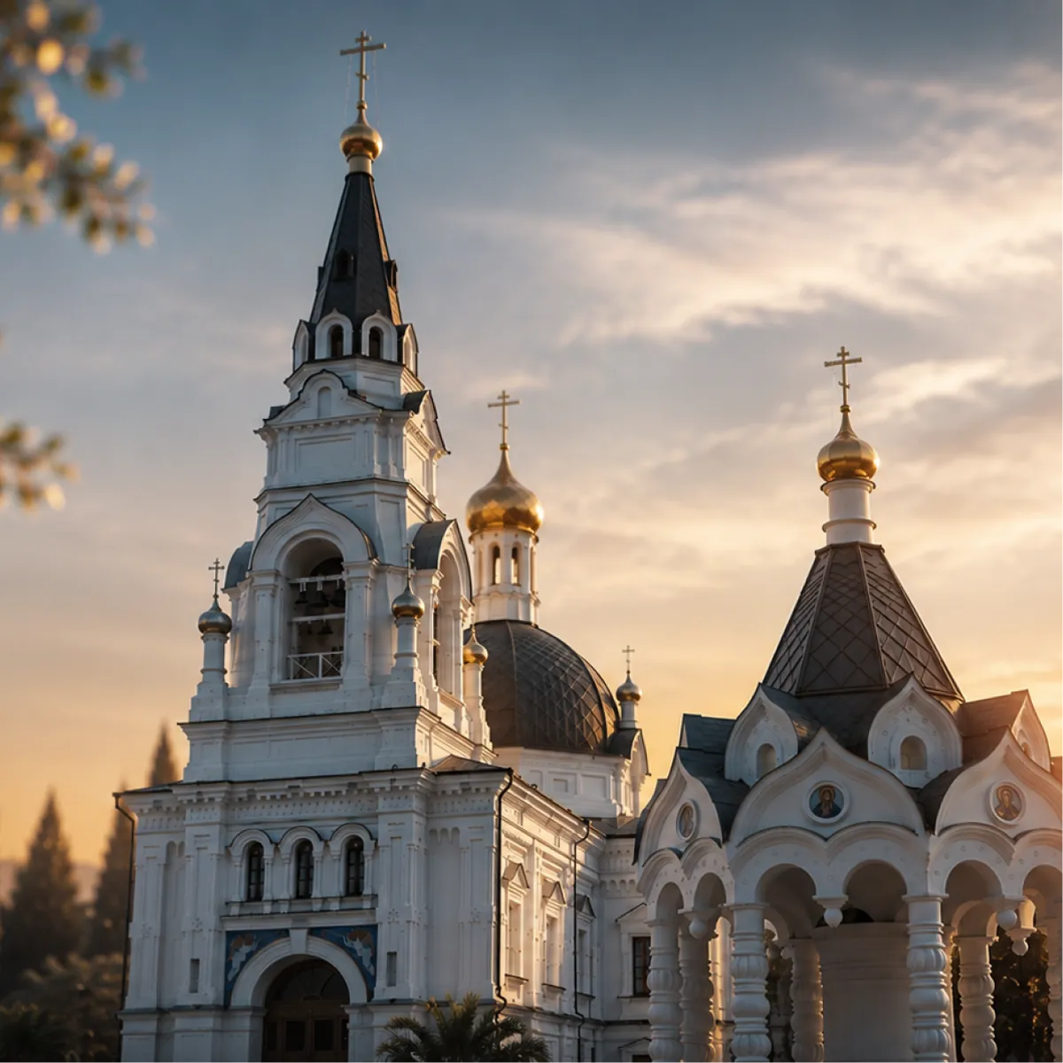
The mark is the cathedral's church and its water-blessing rotunda: arches, tent roofs, crosses. The line is thin, like an outline on tracing paper. Light runs along it once and ends on the cross.
The church on the left, the water-blessing rotunda on the right. A thin line follows their silhouette, the crosses stand on the axes.
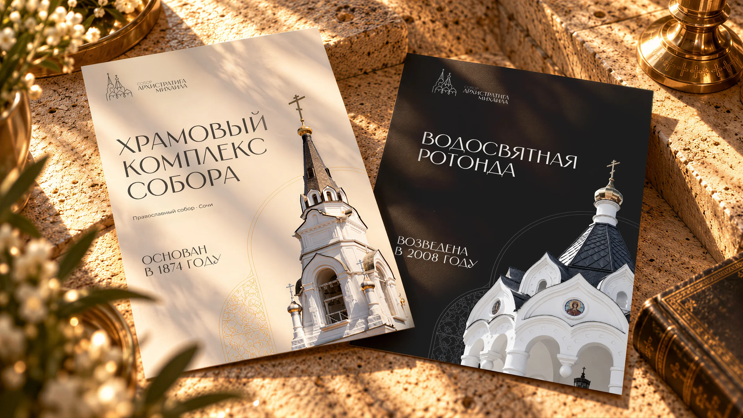
A warm light background like the white stone of the walls, graphite like the dark roofs. Gold only for the mark's line and labels, no large fills.
Full sentences, dates, names and address. The cathedral is open for prayer — it needs no advertising pressure.
module, axes, angles