A brand that keeps its word
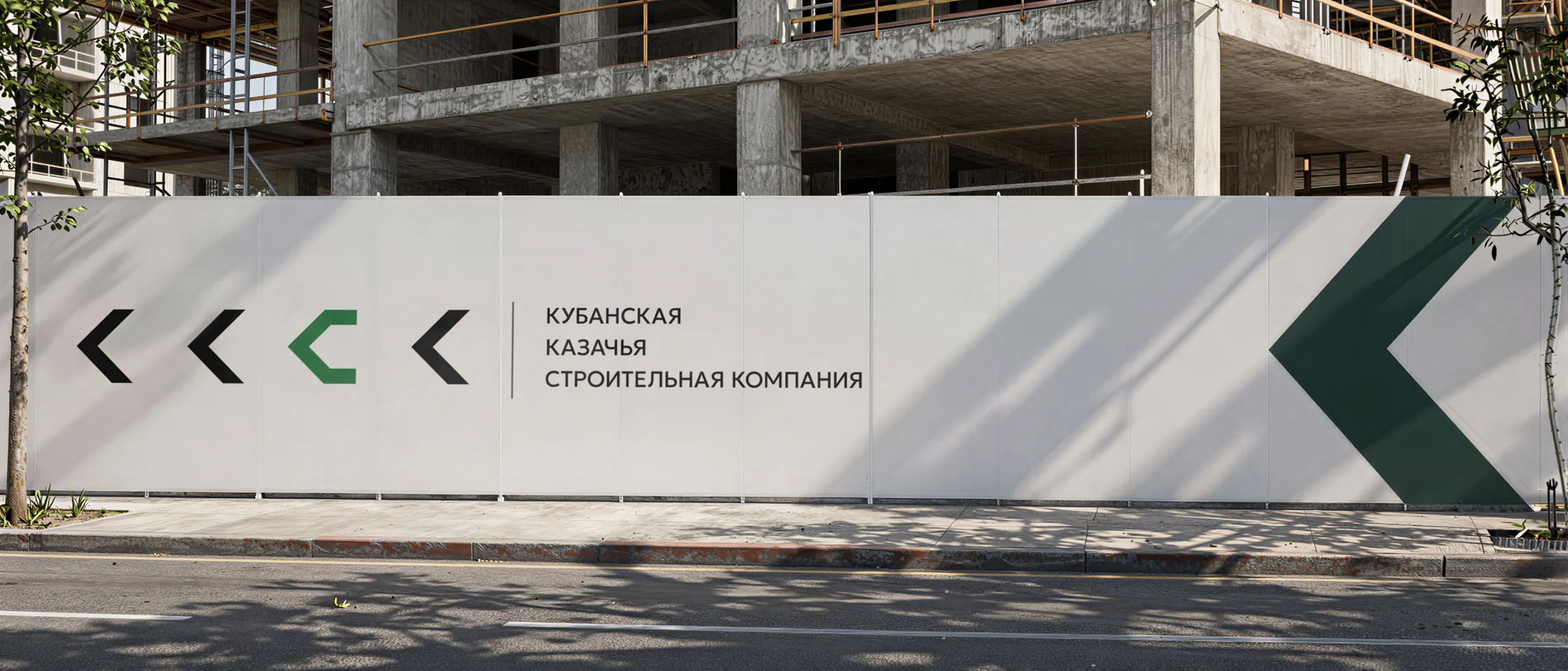
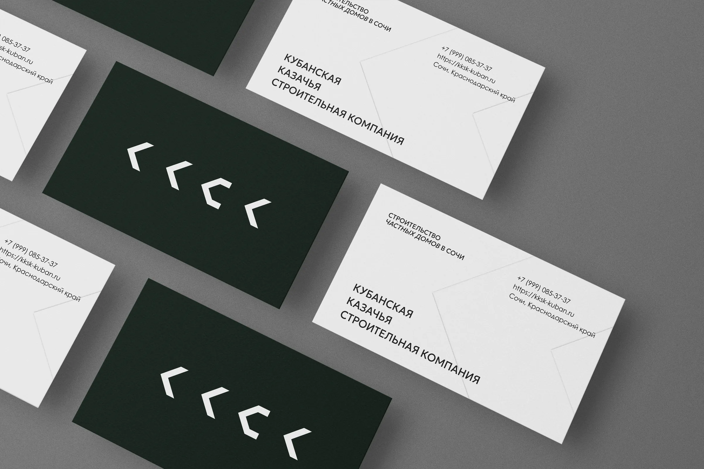
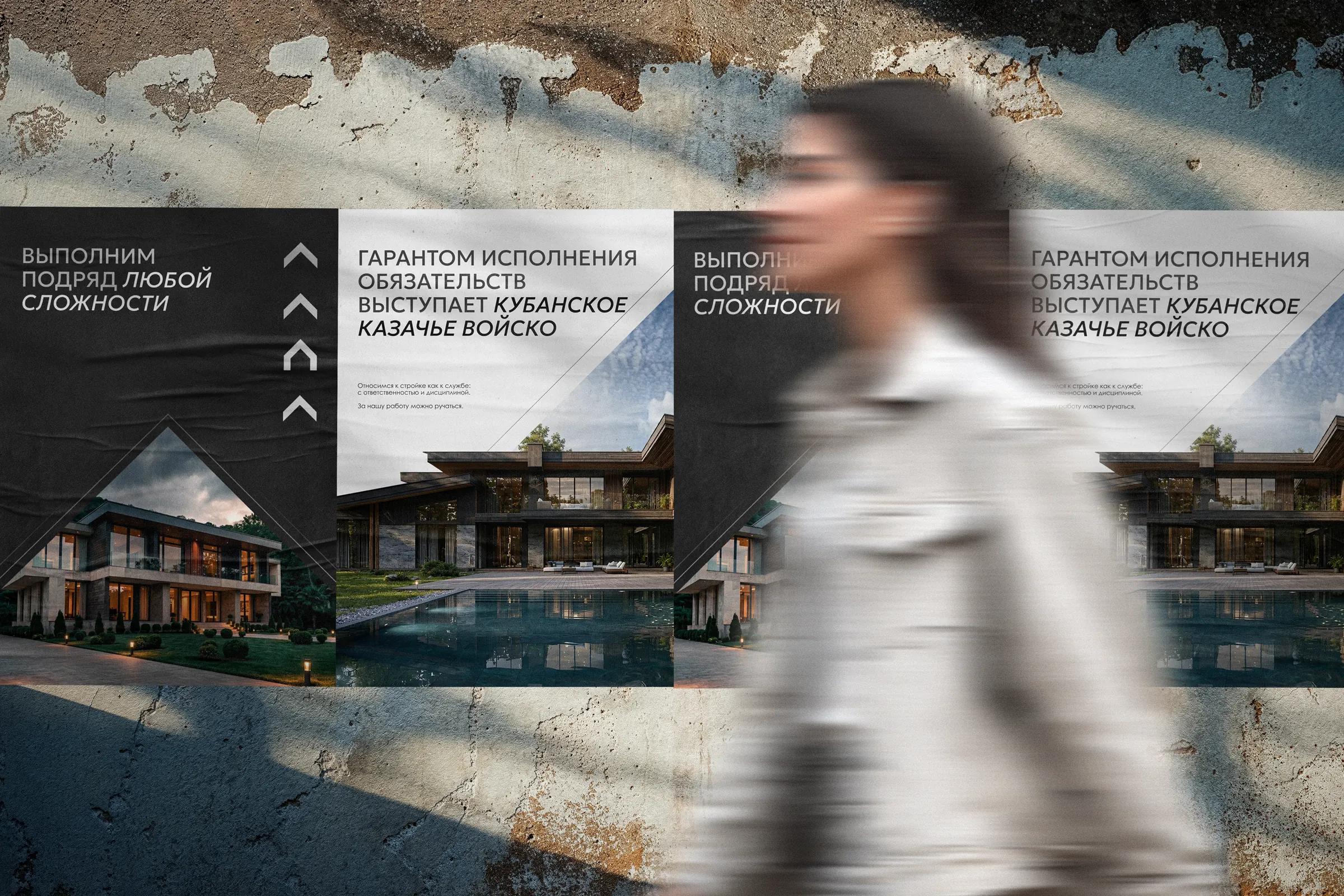
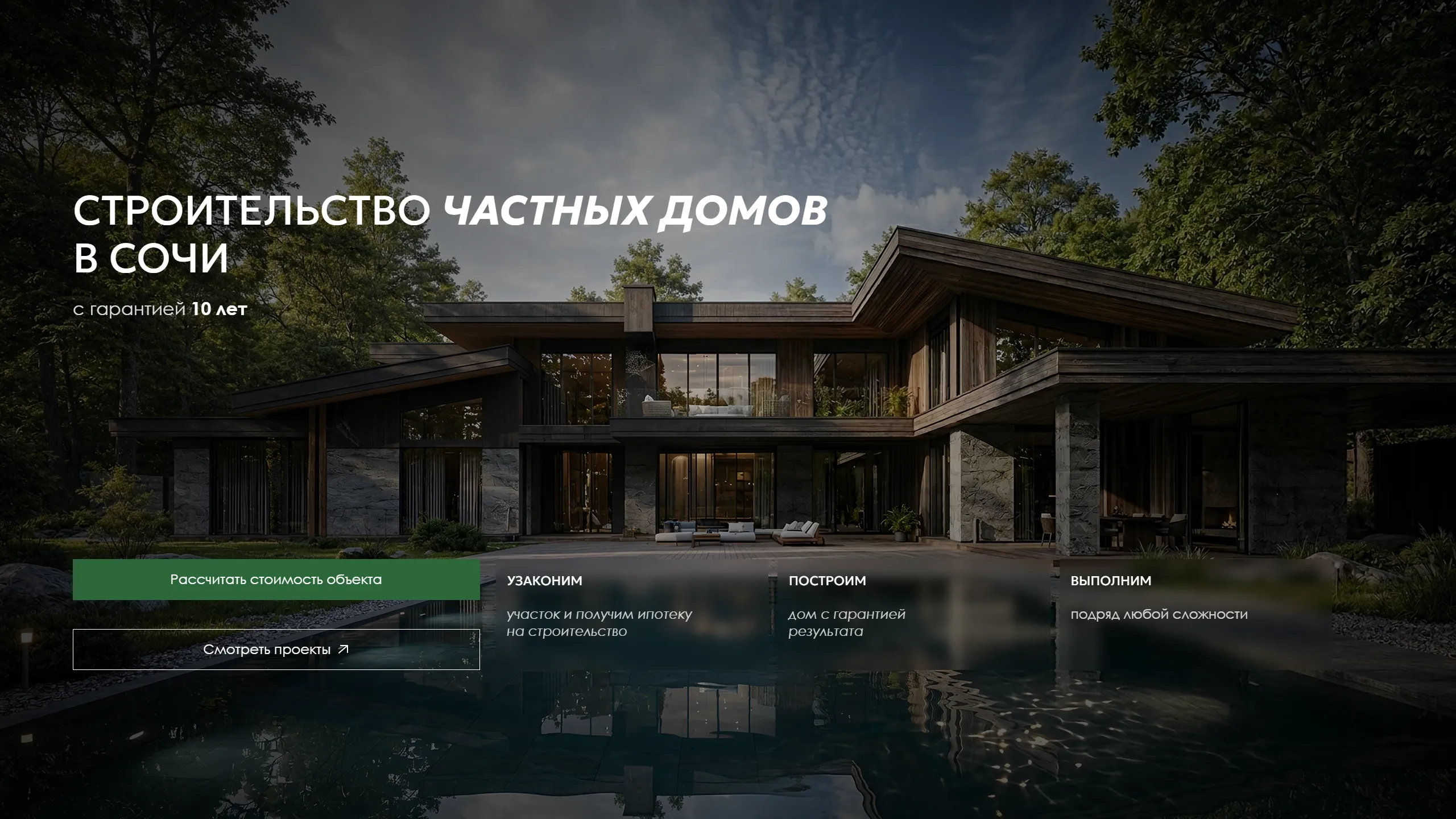
The visual identity of the Kuban Cossack Construction Company: a short name, a mark of four chevrons and a system that works from a business card to a construction site hoarding.
The main fear of anyone commissioning construction in Sochi is an unfinished build: the contractor takes the money and disappears. KKSK has an answer competitors don't — the guarantor of its obligations is the Kuban Cossack Host. We needed a brand that conveys this guarantee calmly and in a modern way: no papakha hats, ornaments or “old-fashioned” typefaces.
meaning first, form second
The visual system is a consequence of the position, not decoration. First we formulated what KKSK promises, to whom and how it proves it.
“The contractor takes the money and disappears or misses the deadline” — the brand answers this fear head-on instead of avoiding it.
Price and deadline are fixed in the contract. The Kuban Cossack Host — co-founder and guarantor of the company — answers for delivery.
An average market price and a result without surprises. “Cheap” in construction almost always means an unfinished build and rework.
from a long name to a short brand
We moved the company to the abbreviation KKSK. This decision changes not only the length of the name but also how it is perceived.
Sounds solid but heavy. The emphasis on the word “Cossack” first suggests a cultural or public organisation — and only then construction.
Neutral and corporate. The origin and regional identity are preserved, but the brand isn't confined to the Cossack theme and sounds like a modern construction company.