Two letters — one construction
The logo of Polina Maksach's law firm: a PM monogram (ПМ) in which the П rests on the М like a beam on its pillars. One module, one angle, two colours — wine and graphite.
Polina Maksach is an intellectual property lawyer: she registers trademarks and defends them in disputes. The mark of her own firm has to pass the same test as her clients' marks — be distinctive. So no scales, Themis or columns that every second lawyer has: only initials assembled into one strict figure.
p over m
The mark reads as ПМ and at the same time as a single figure. The П is a wide beam with bevelled ends and short supports. The М stands beneath it at full height and rests on the baseline. The letters never touch each other — a shared rhythm holds them together.
Scales, Themis and columns are the shared vocabulary of the profession — it can't be made your own. What the firm has of its own is a name.
The П lies on top and covers the М. Together — a canopy under which it is safe: exactly what people come to a lawyer for.
Straight strokes, sharp bevels, not a single curve. The mark looks like a document, not an advertisement.
one stroke, one angle
Everything is built on a single module — the stroke thickness M. The verticals of the П and М, the beam height and the gaps between strokes all equal M.
All the bevels — the beam ends, the support ends, the diagonals of the М — run at a single angle of 50°. That's why the mark doesn't fall apart into details either on a signboard or in a 16-pixel favicon.
mark, wordmark, four versions
The “Law firm” wordmark is a light geometric grotesque in two lines. It stands to the right of the mark on its baseline and takes up the lower half of its height: the mark speaks first, the wordmark explains.
The primary version is wine and graphite on white. For dark backgrounds and for wine — the white one; monochrome — for single-colour printing. The mark without the wordmark lives in the avatar and the favicon.
wine and graphite
The palette came from the firm's website and became the rule. Wine — only on the mark and the main button, graphite instead of pure black, the rest — greys and white. Garnet is a light shade of wine for hover states and highlights.
scales in the background, the name in the mark
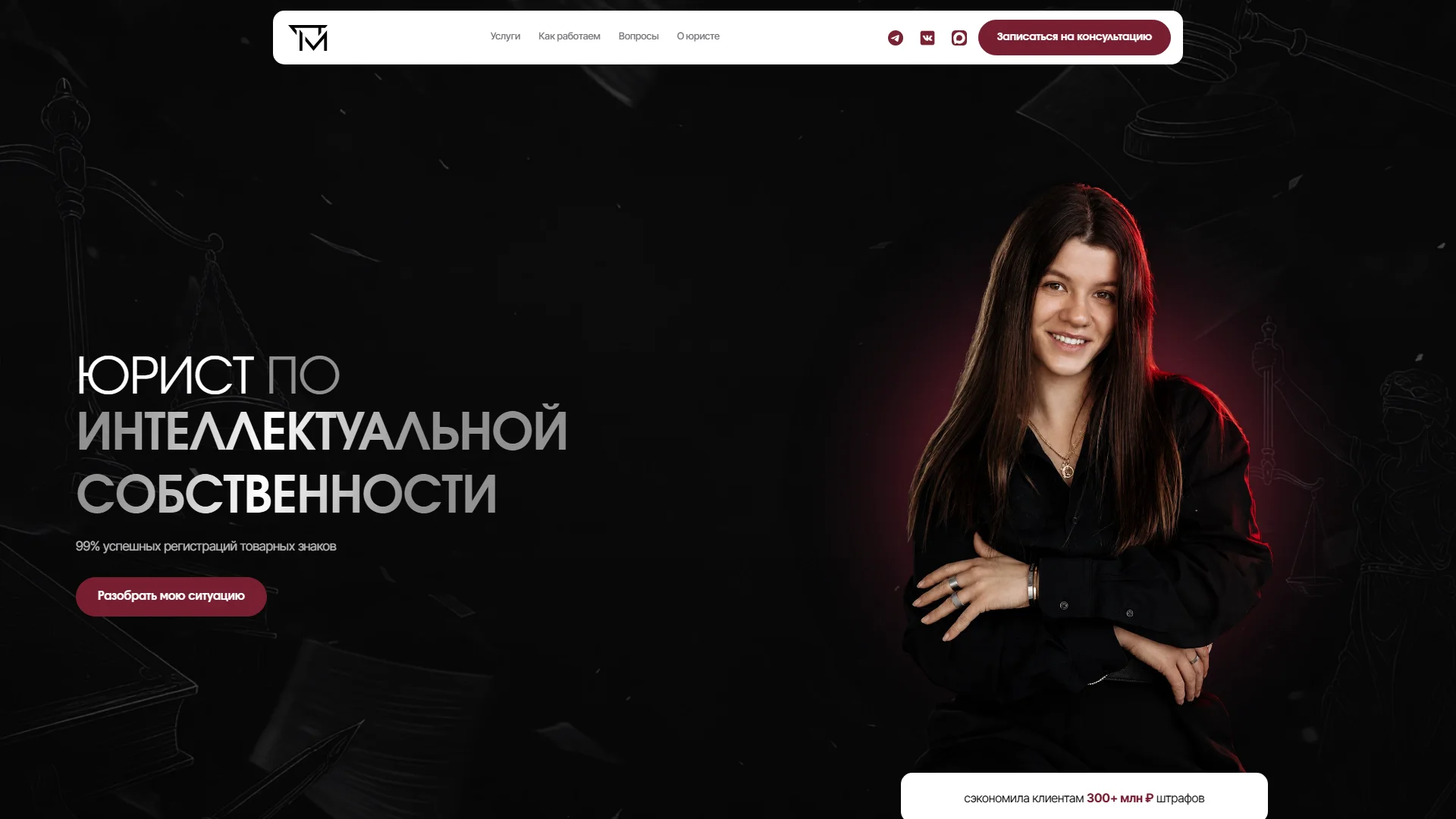
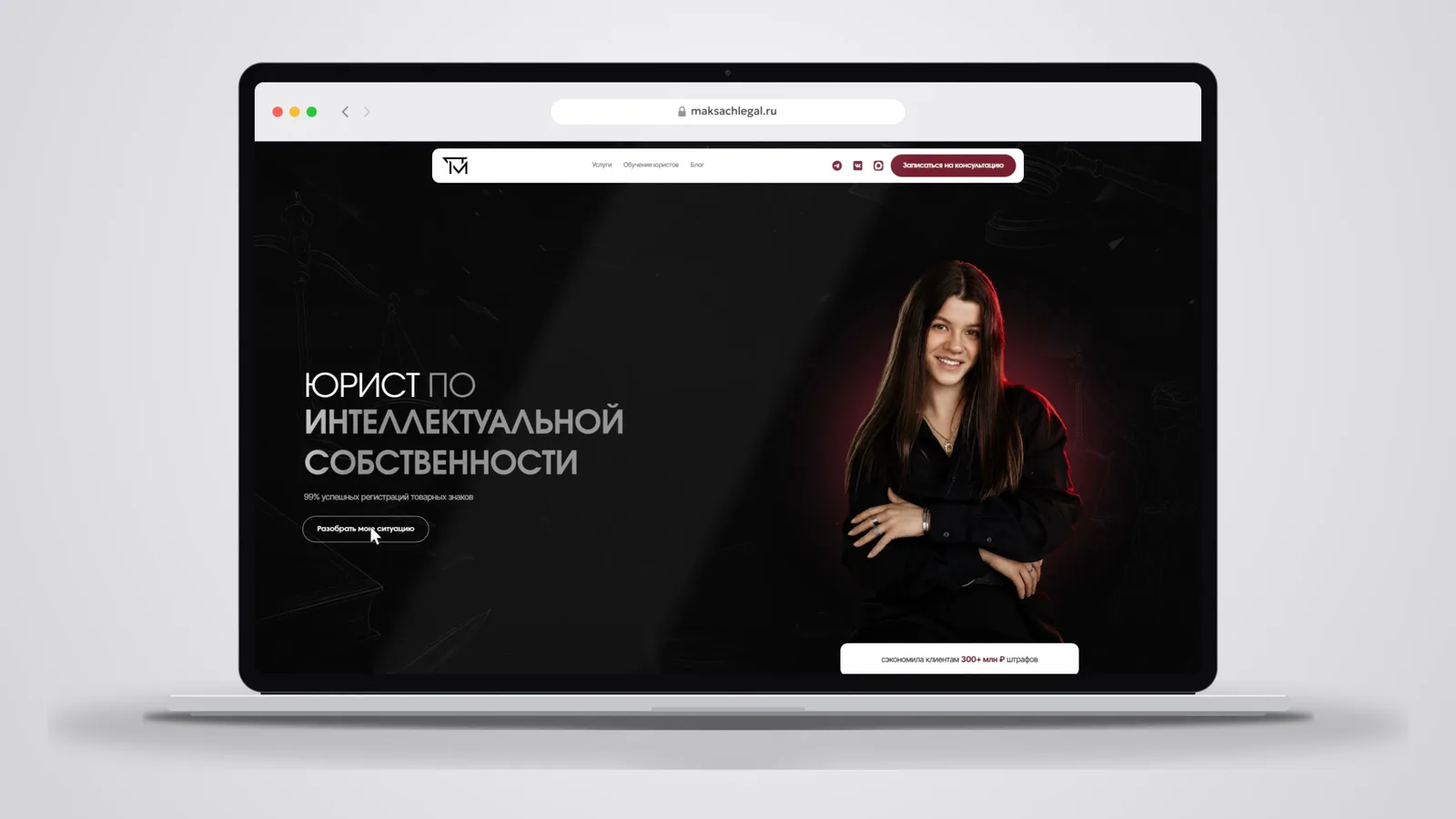
The mark already works in the header of the firm's website — in a white floating panel above the dark first screen. The scales and Themis stayed in its background: there they create atmosphere, whilethe firm is recognised by its monogram.
So the symbols of the profession and the mark don't compete: the clip with scales, Themis and flying sheets sets the tone, while the white monogram over it remains the only thing that belongs to this particular firm.