Rejected logos
Logos and symbols that didn't win the client's approval
About the project
Not every concept makes it to the final. Behind every approved logo are dozens of options the client didn't go for: too bold, too strict, “not the right mood”.
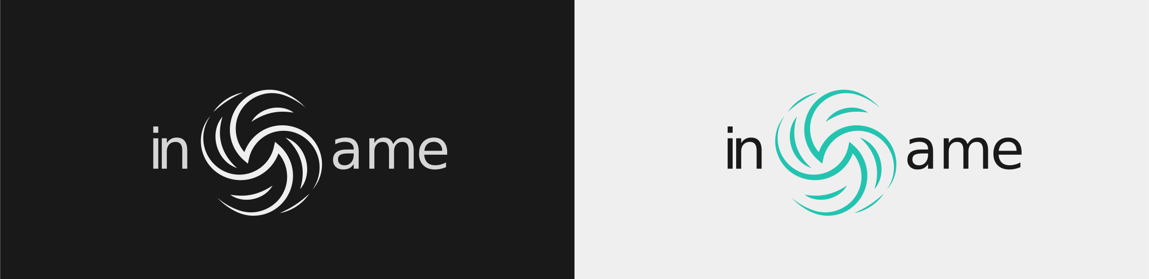
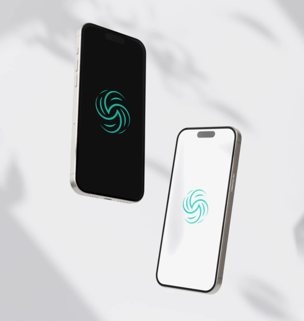
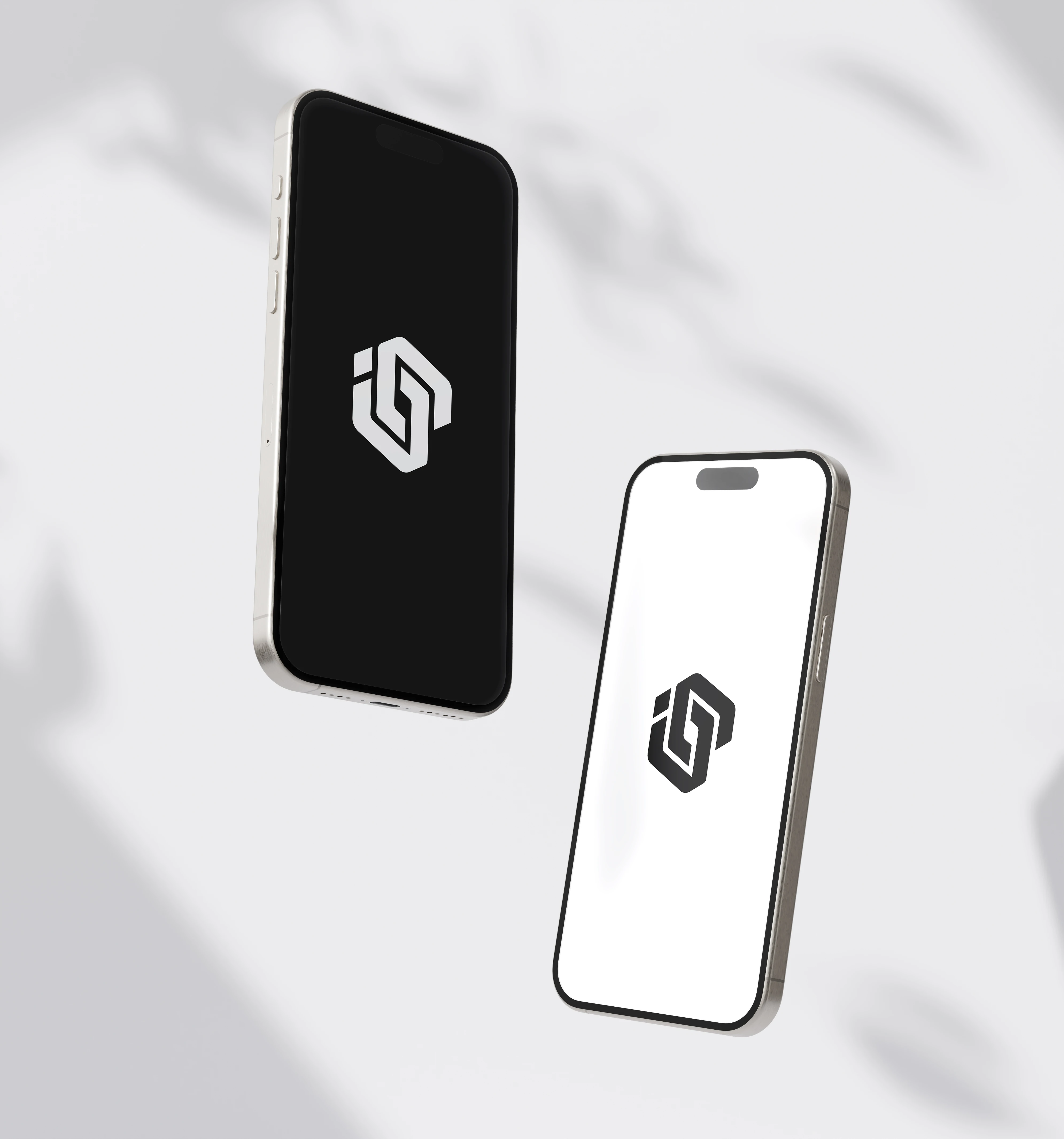
This selection is an archive of rejected marks. Strong ideas that stayed in drafts but deserve to see the light.
Concept 01
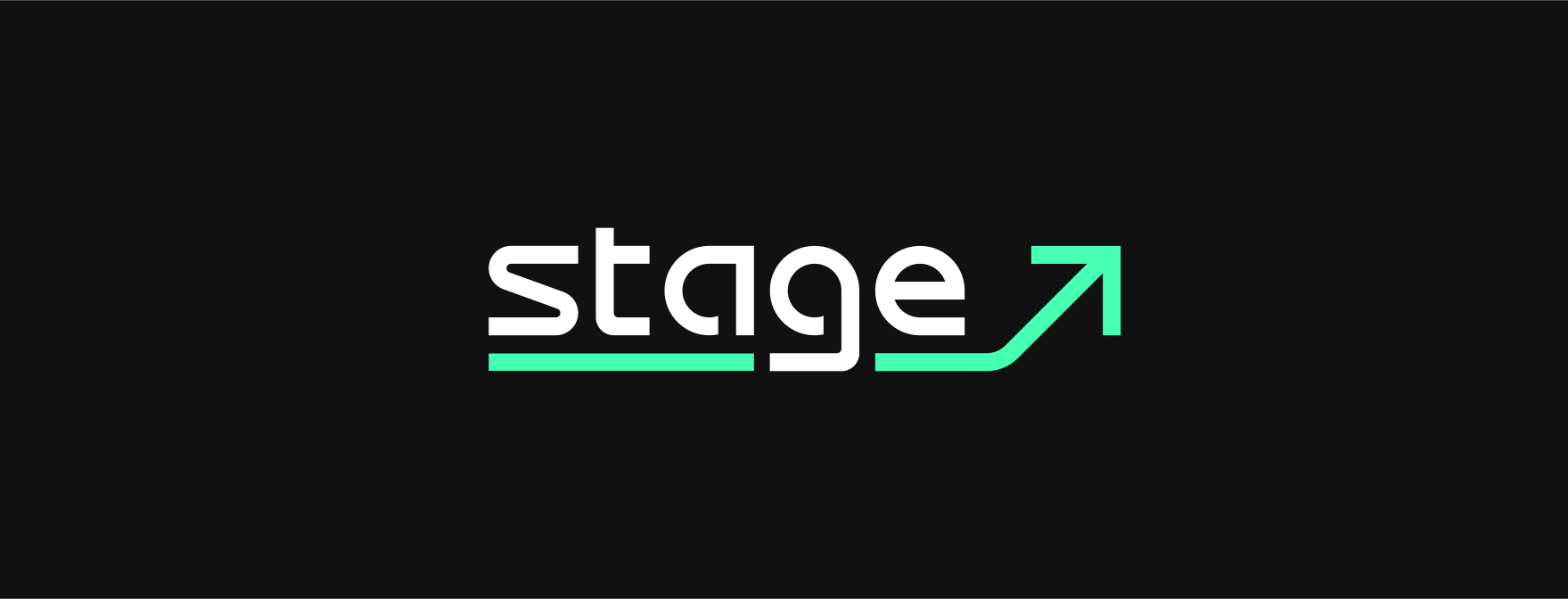
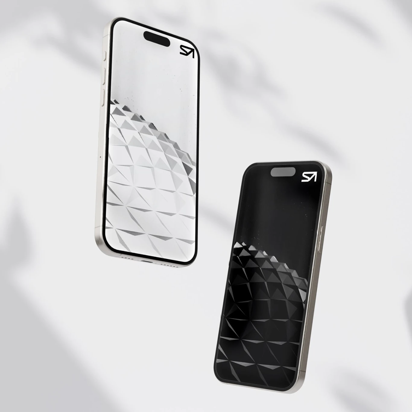
Stage


Concept 02
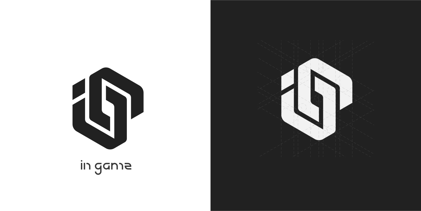
InGame
want a logo that gets approved?
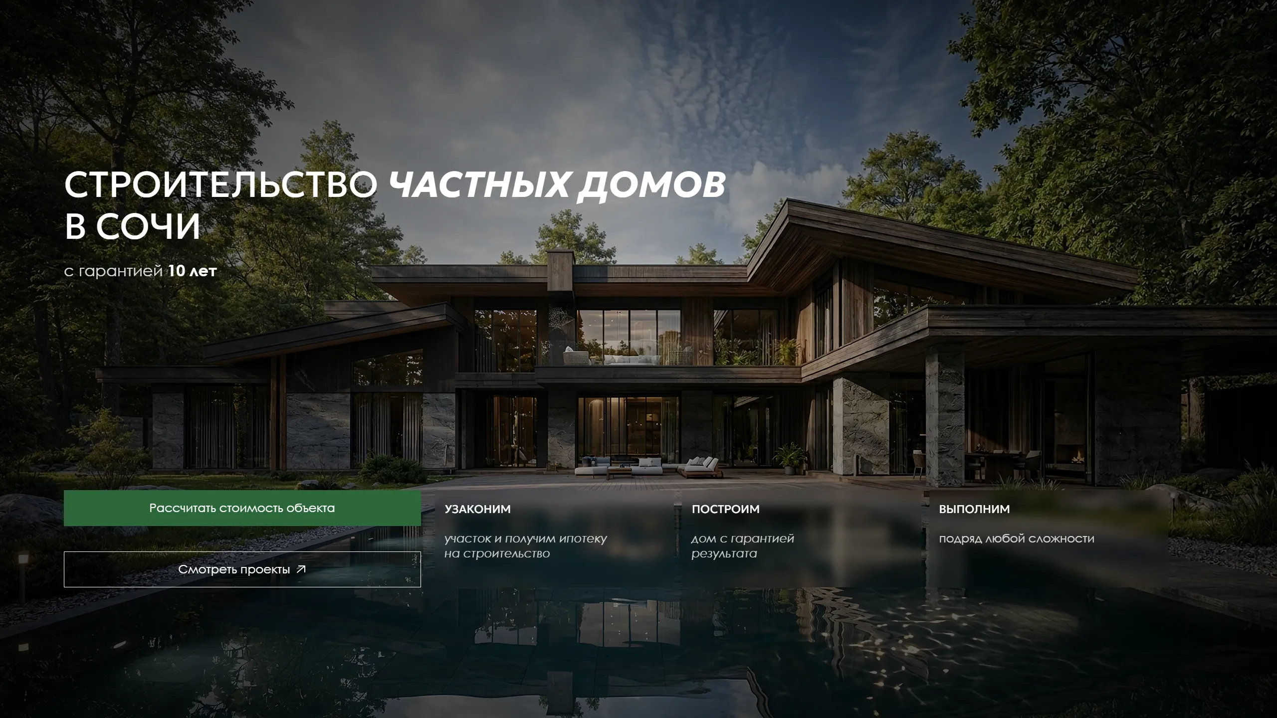
Next caseKKSK — construction companyA website that sells trust: construction in Sochi backed by the Cossack host