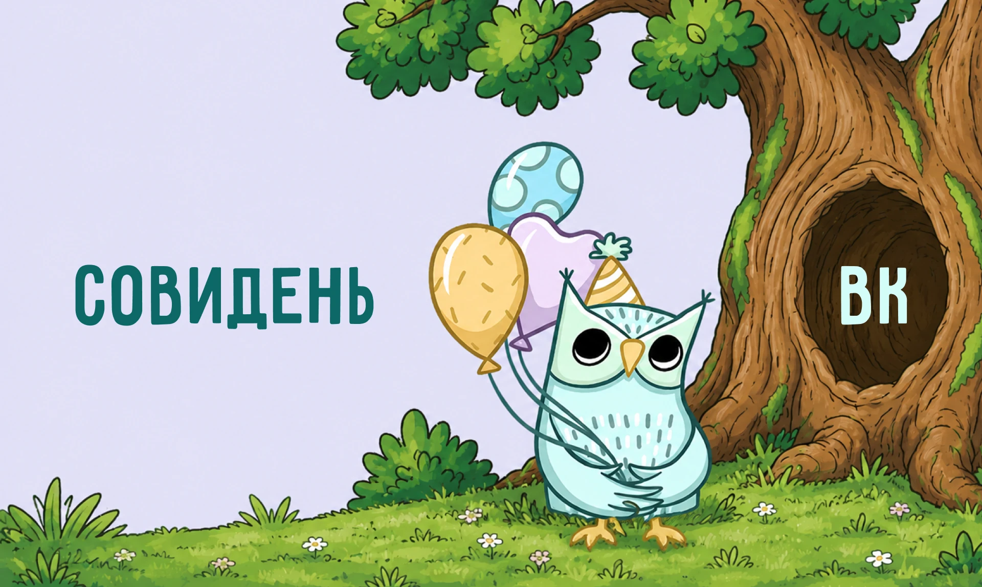
SoviDen
A themed children's party studio in Lipetsk
About the project
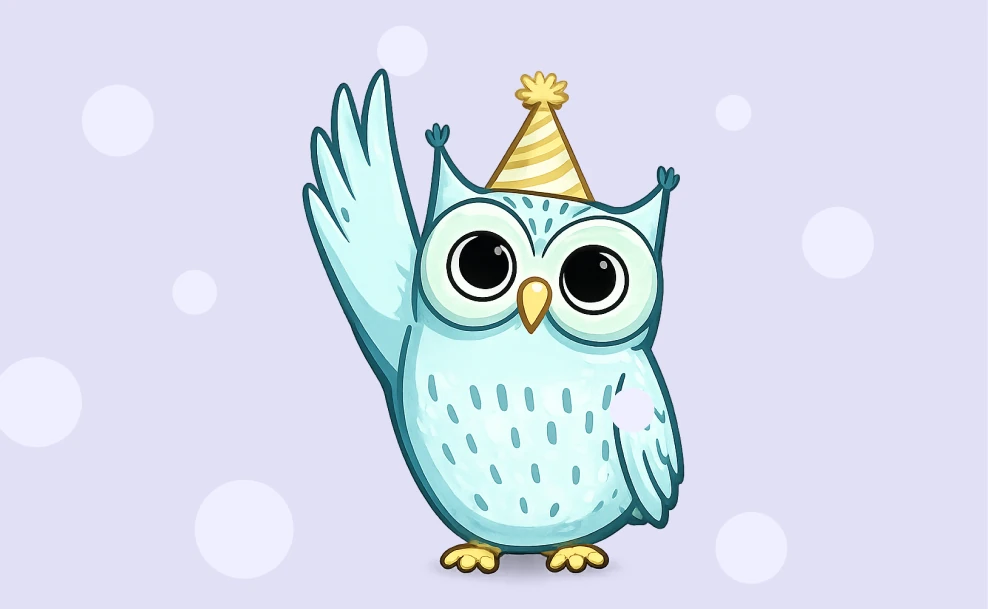
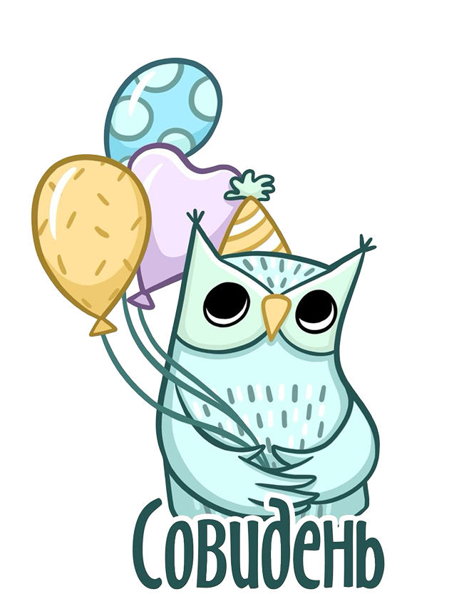
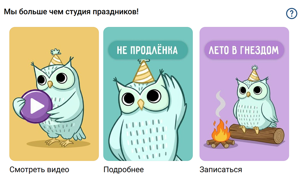
The new visual style brings together the brand mascot — an owlet — so the community became recognisable and emotional.
What we did
- Uncovering the core idea
- Developing selling points and marketing triggers, strengthening the positioning
- SEO optimisation in the name, description and articles
- Planning the marketing structure of every element of the community
- Community design
- Visual styling
Mascot
Community cover
.webp)
Menu
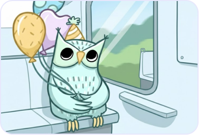
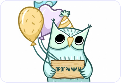
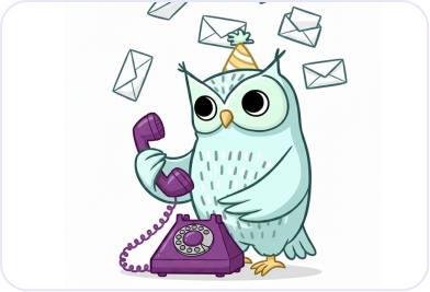
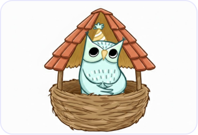
Widgets
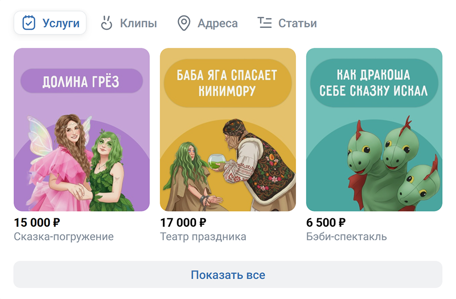
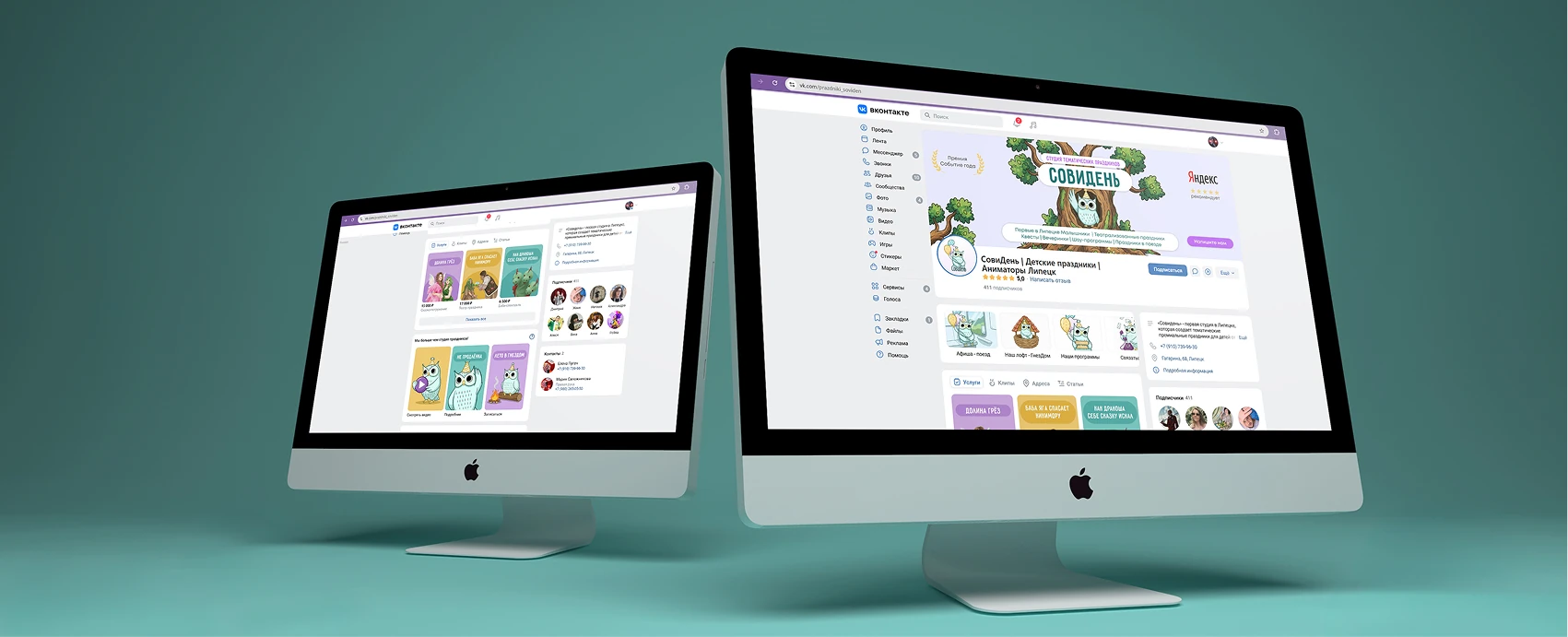
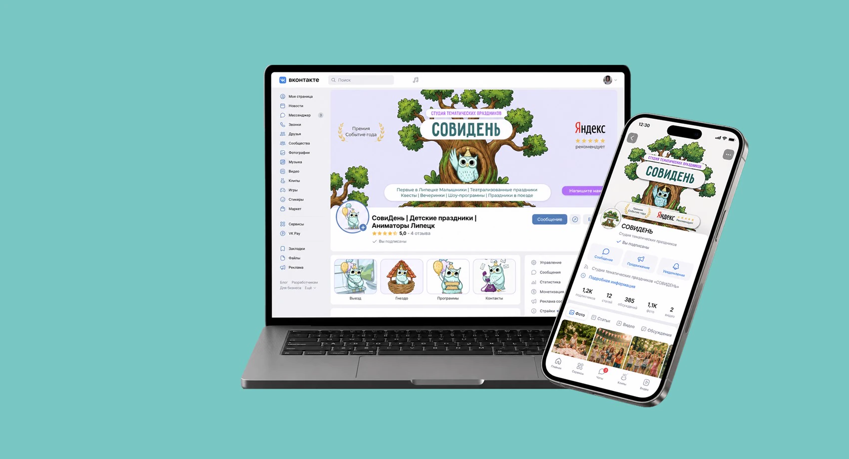
On devices
Result
The community got a cohesive visual identity that immediately conveys the mood of the brand and makes it more recognisable. Thanks to a single visual system the design looks professional, helps stand out from competitors and builds trust among potential clients from the very first seconds.
want a community like this?
Next caseStage — conferenceReaching the Moscow league after the redesign