A stage that is carried in arms
The rebranding of Stage, a conference for a new generation of entertainers in Moscow: a new mark and a visual identity that lives on everything — from the stage and photo zone to badges, merch and social media.
Stage started as a regional conference for entertainers. It needed a brand that would skilfully set it apart from competitors in its visual code, inspire trust among participants and partners and turn the event into a major Moscow event project.
we carried out a large-scale rebranding and created a new mark
Stage is simply “the stage” in English. This idea became the basis of the whole visual concept of the brand.
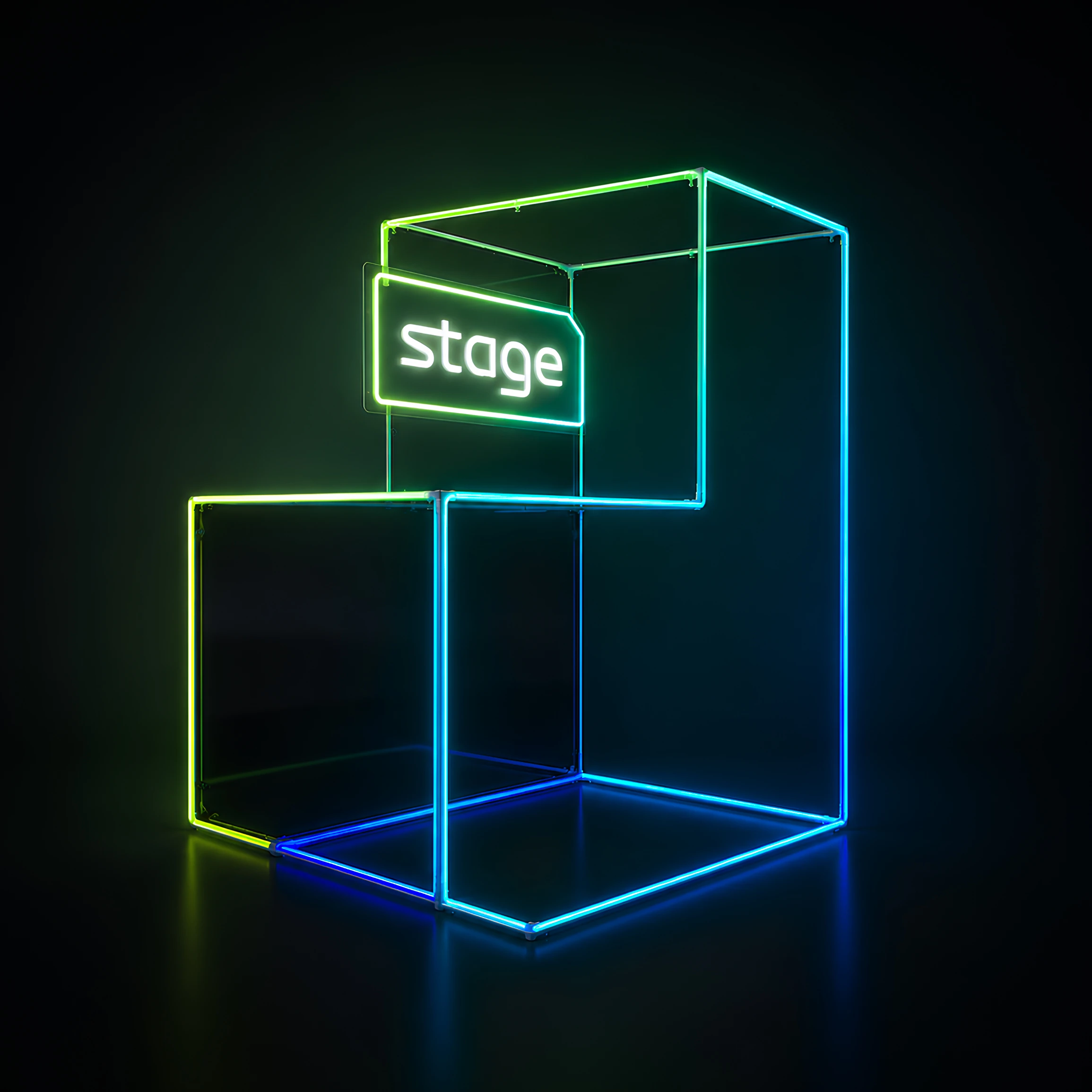
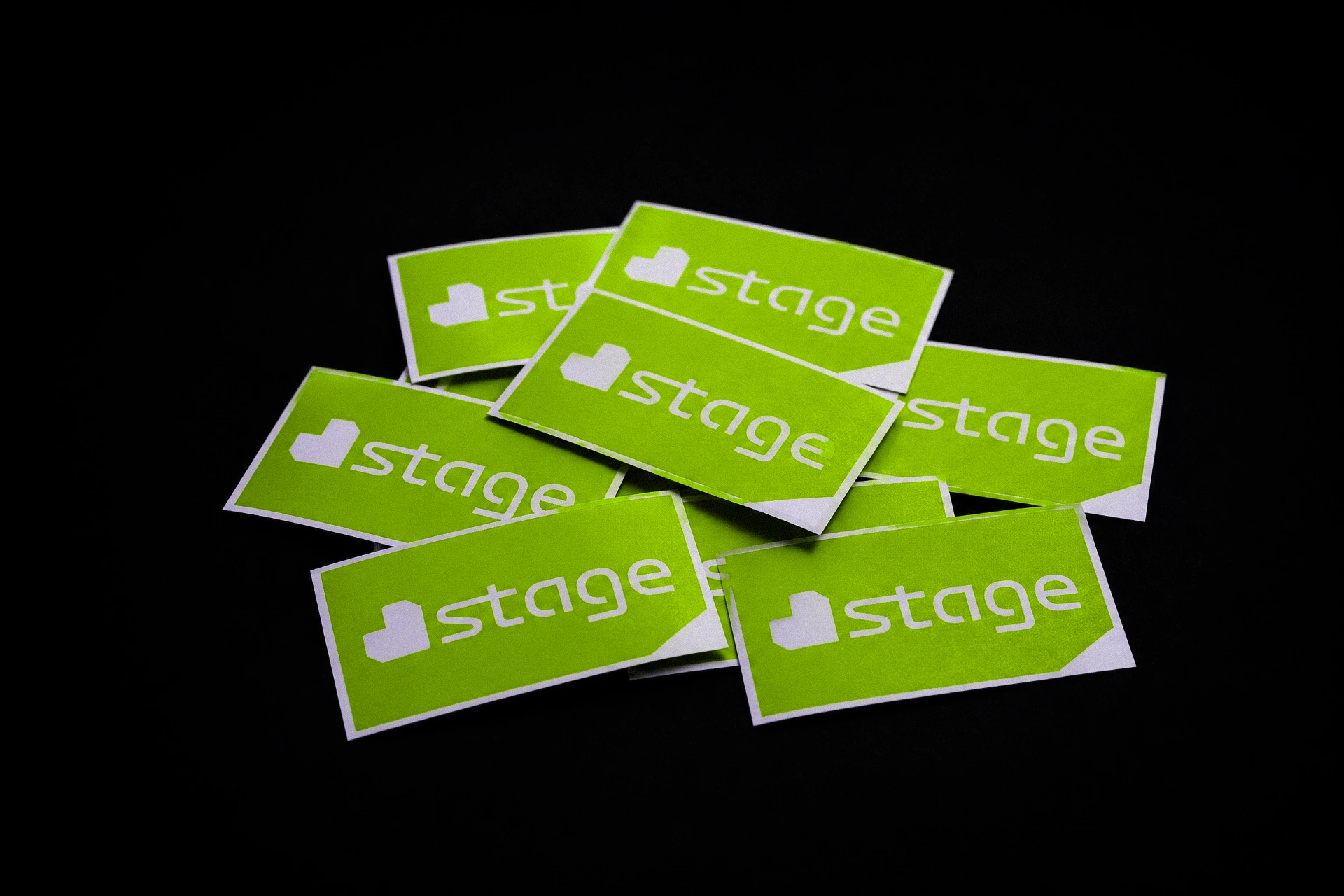
The main element of the logo is a heart made of steps. This image combines two meanings at once: the steps symbolise the path to the stage, development and constant growth, while the heart stands for sincere love of creativity, performing and art.
steps in motion
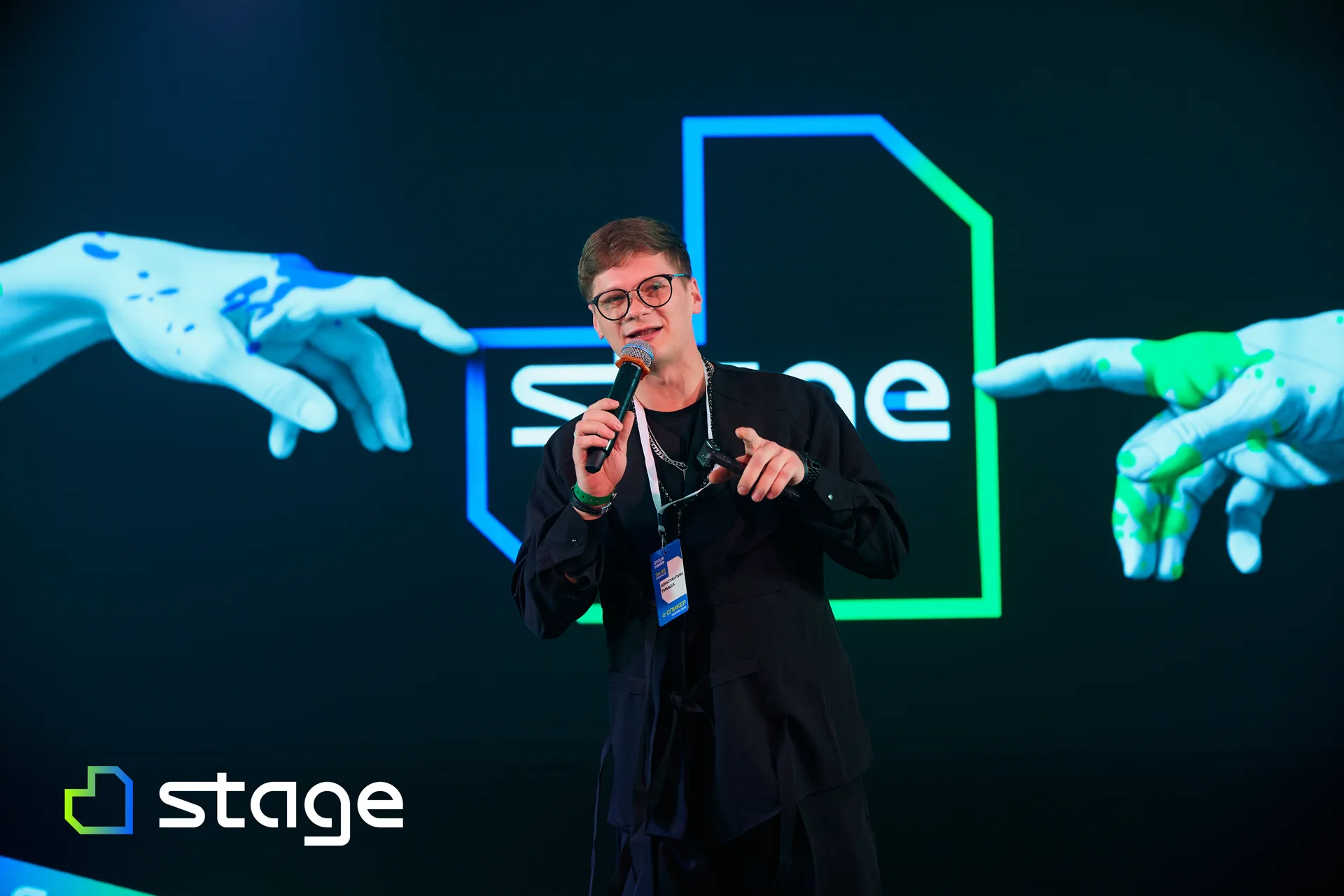
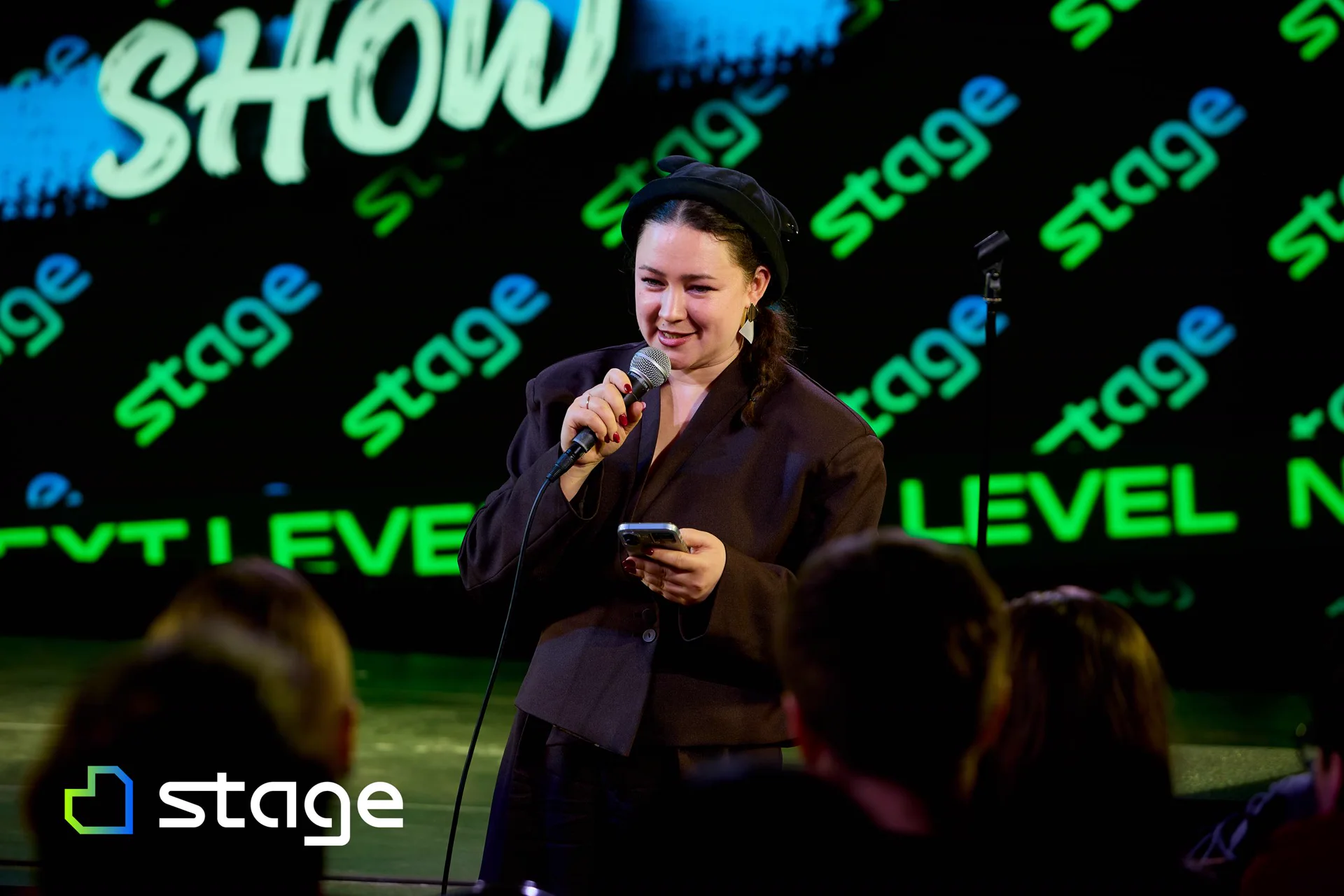
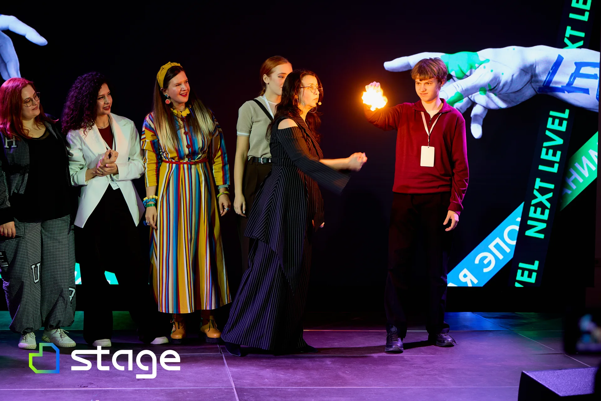
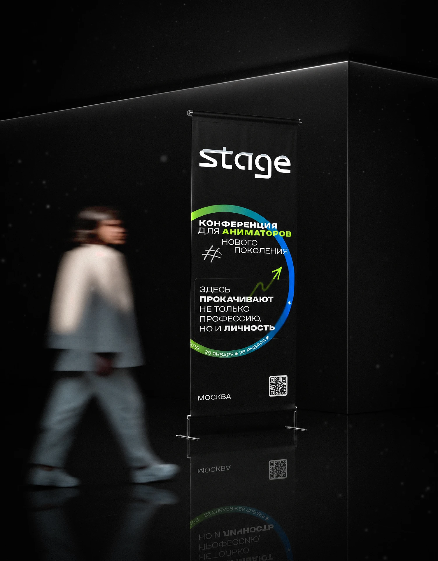
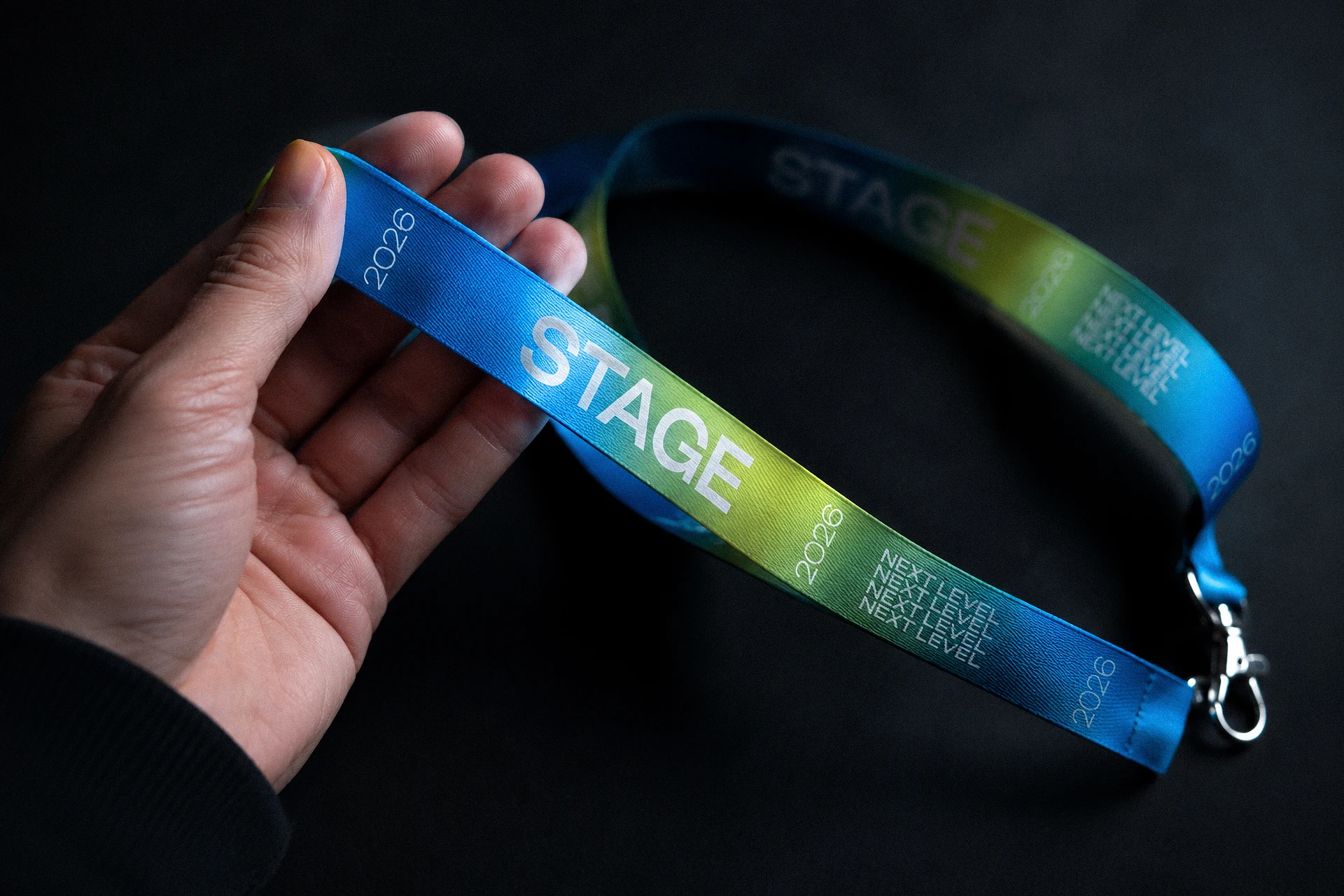
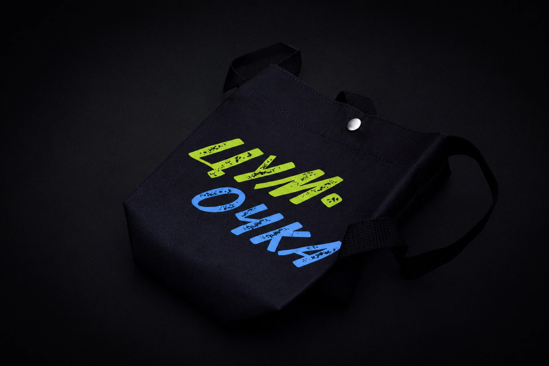
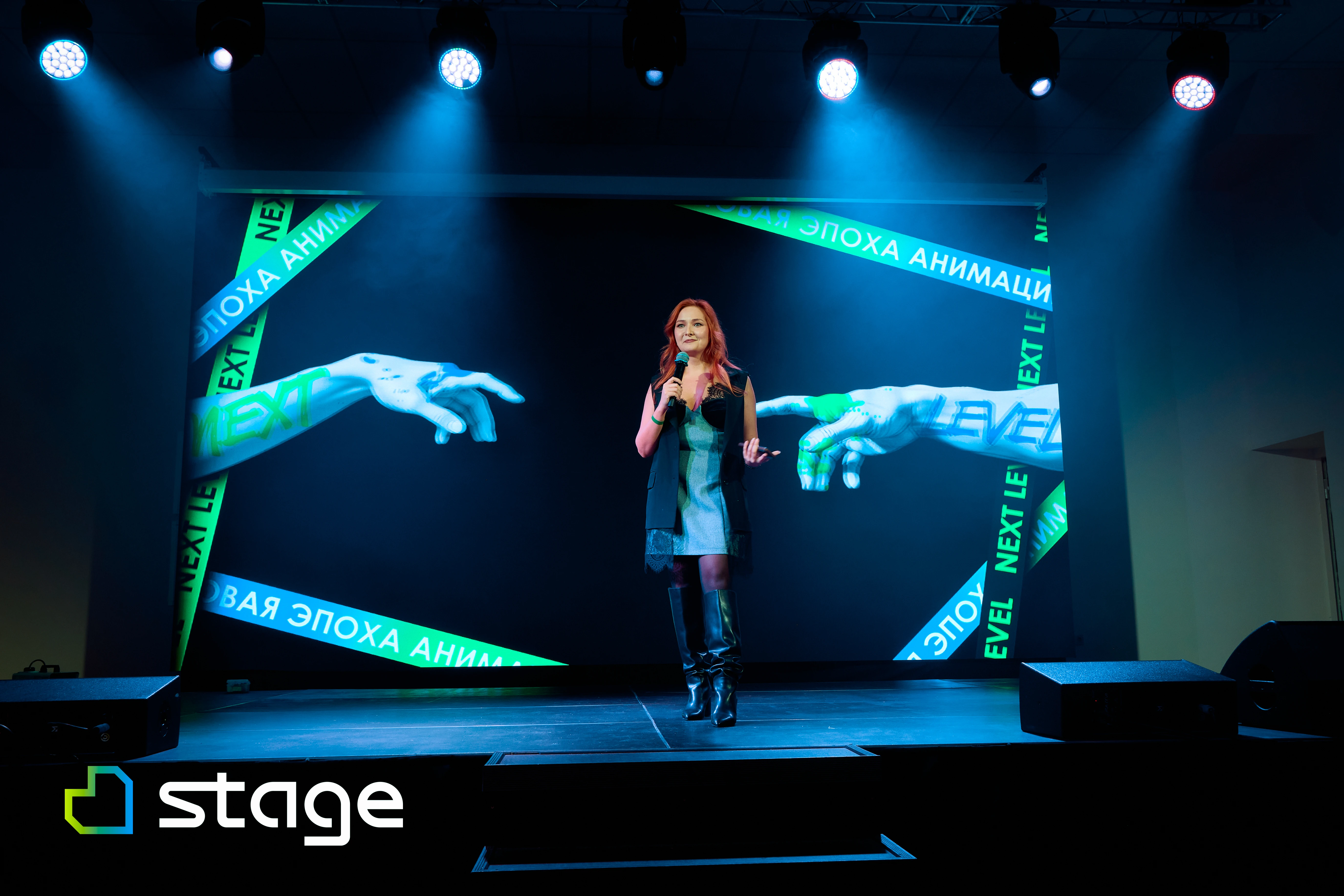
The mark unfolds into kinetic lines and posters, while the brand pattern and the pairing of lime green with blue tie all applications together — from the stage and photo zone to the badge and lanyard.

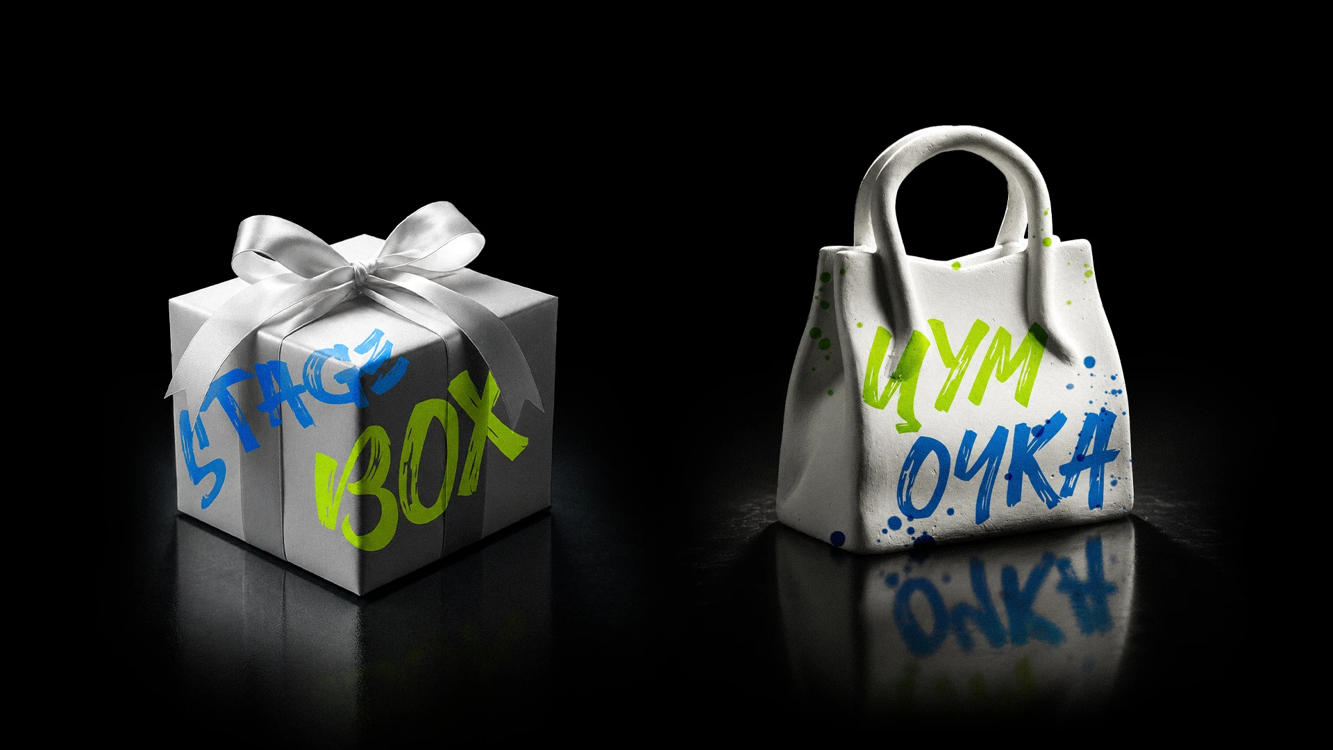
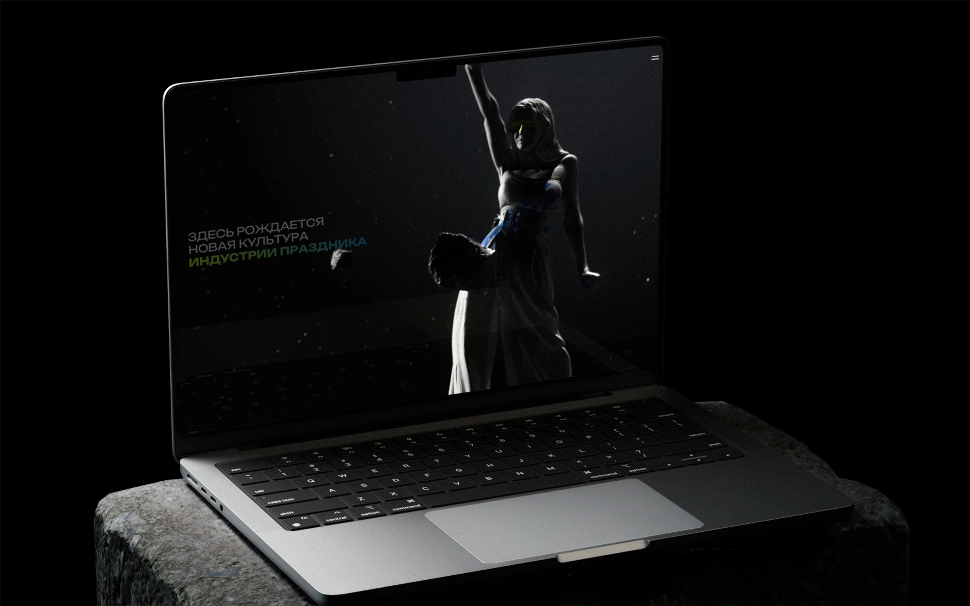
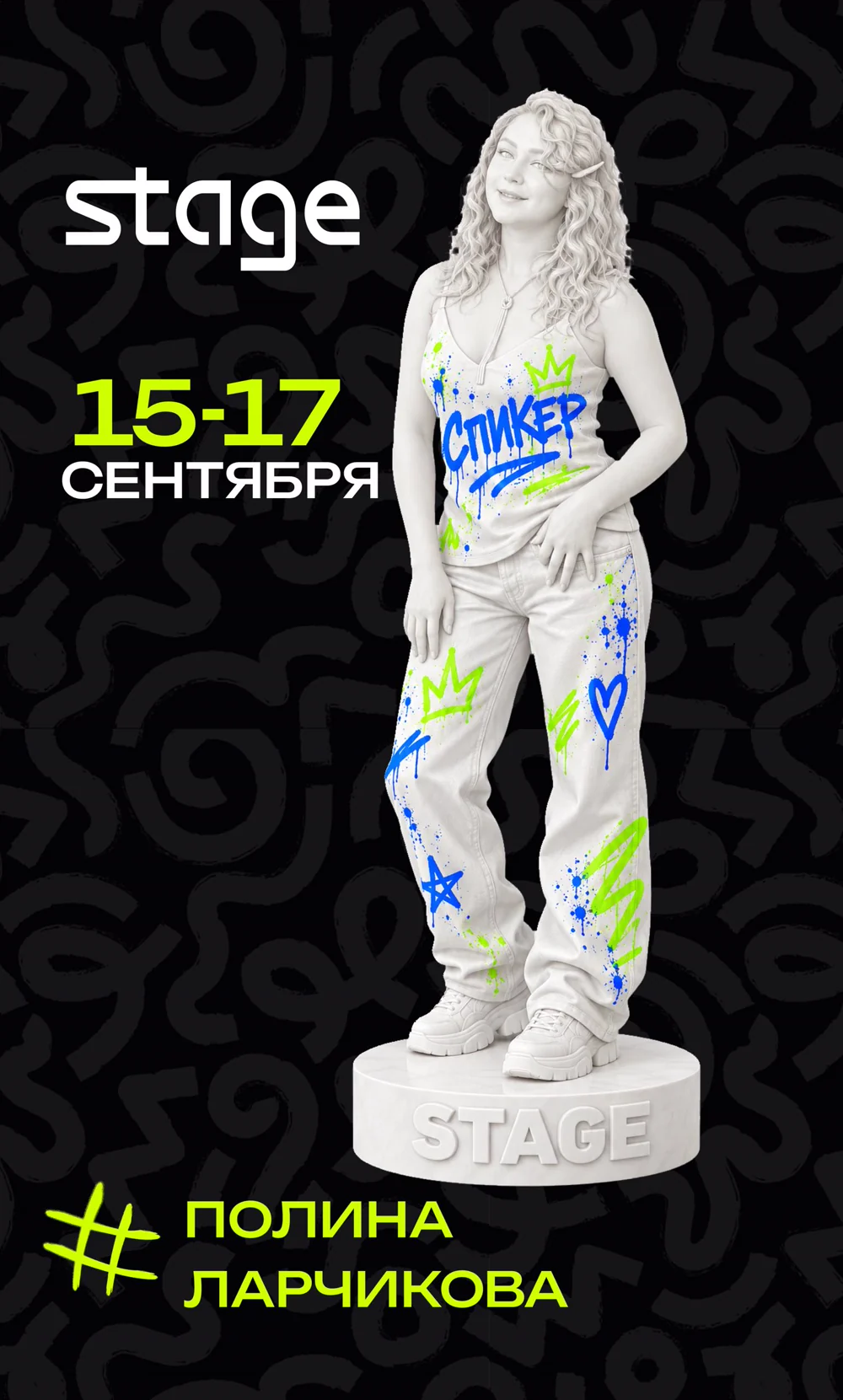
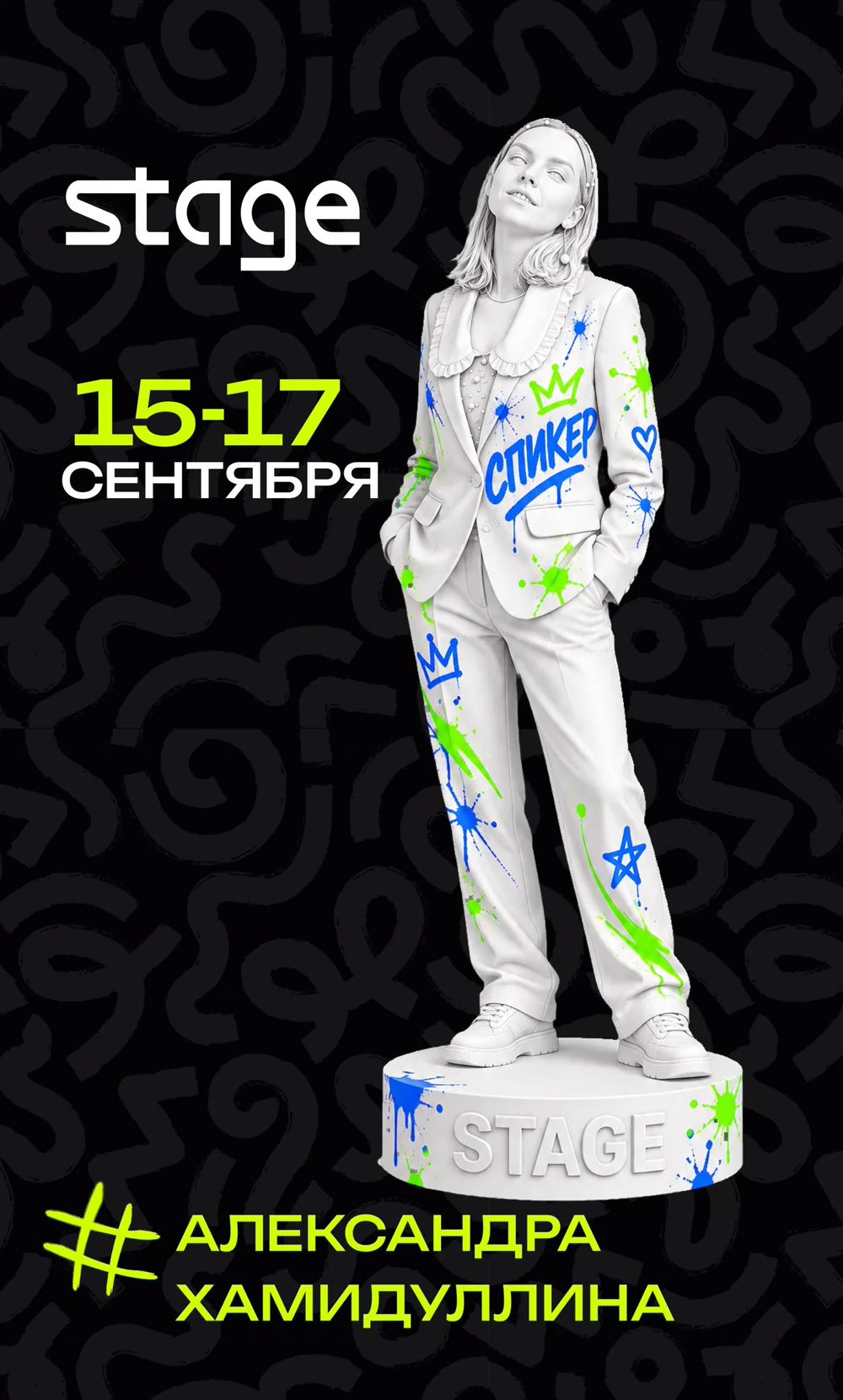
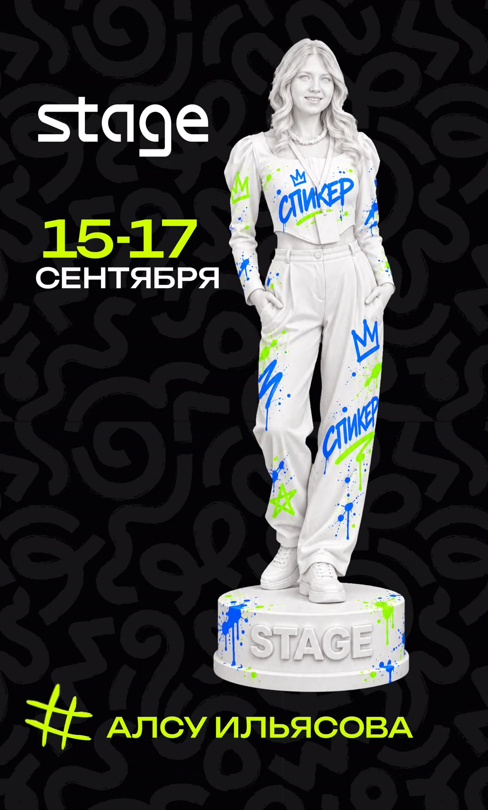
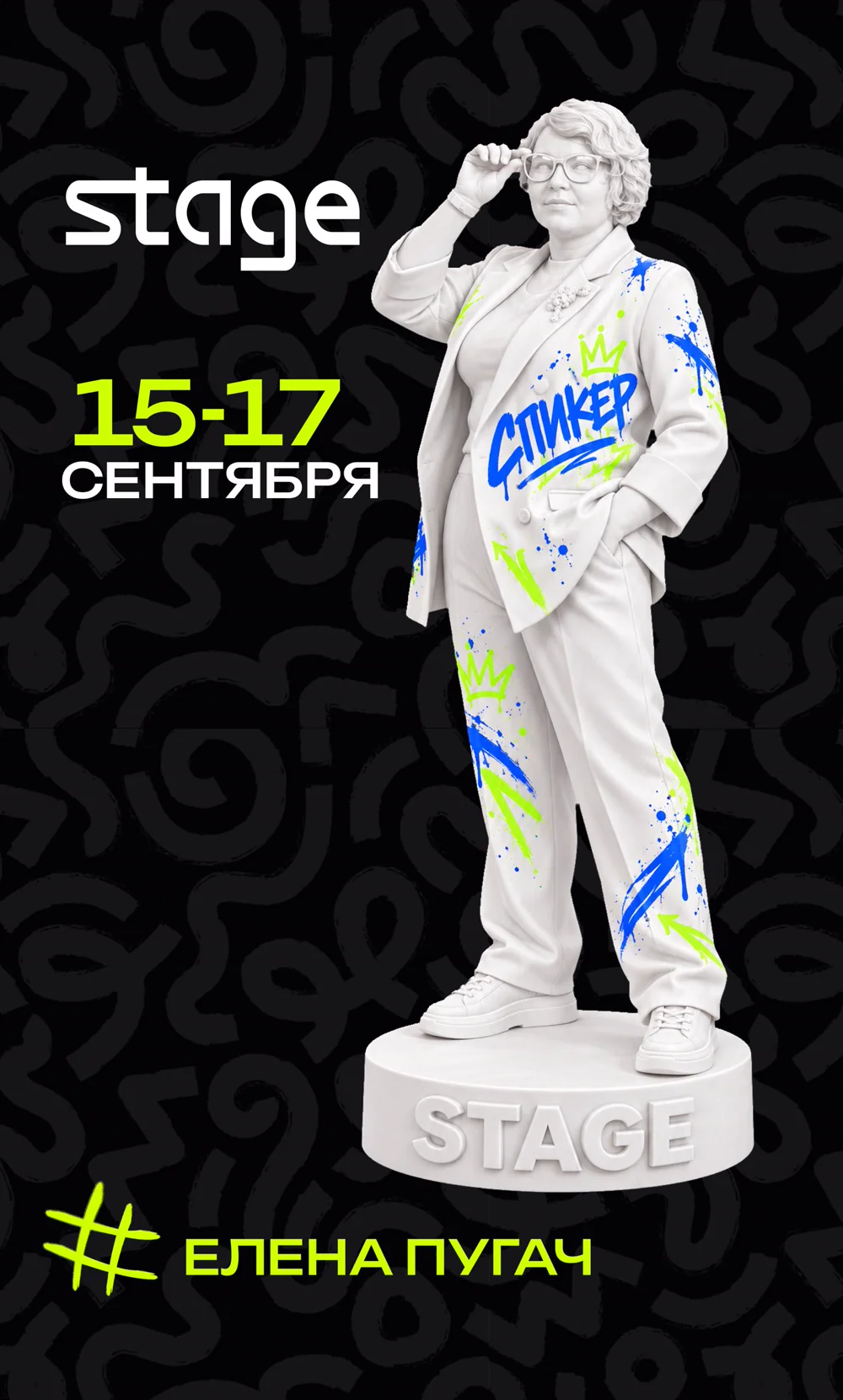
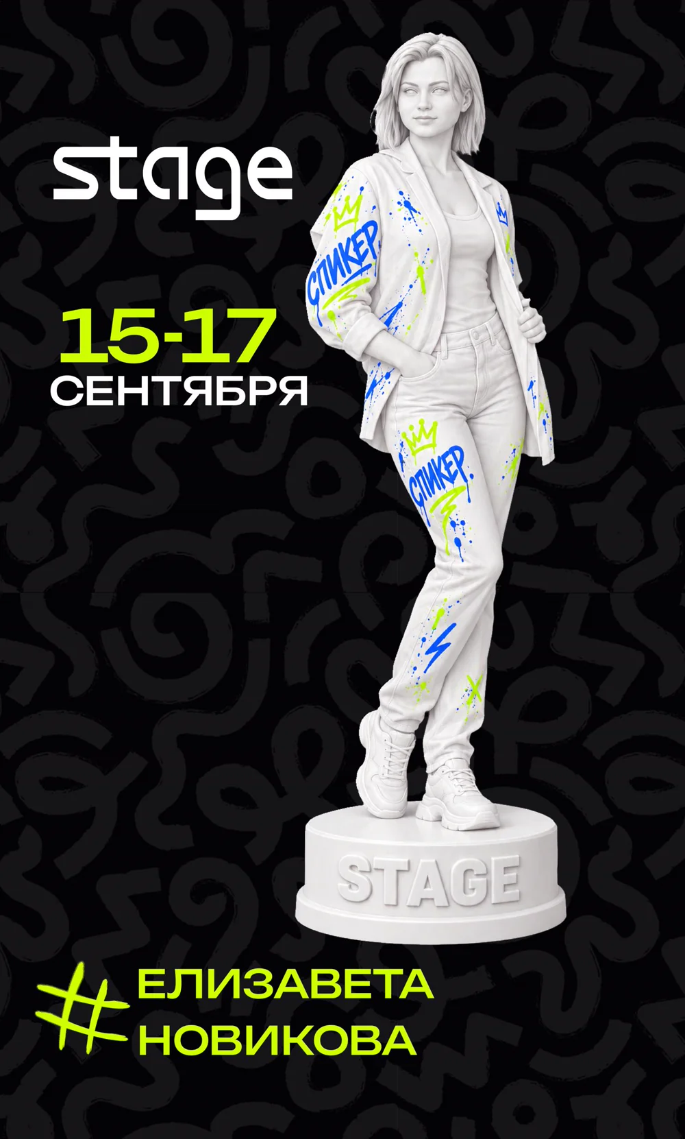
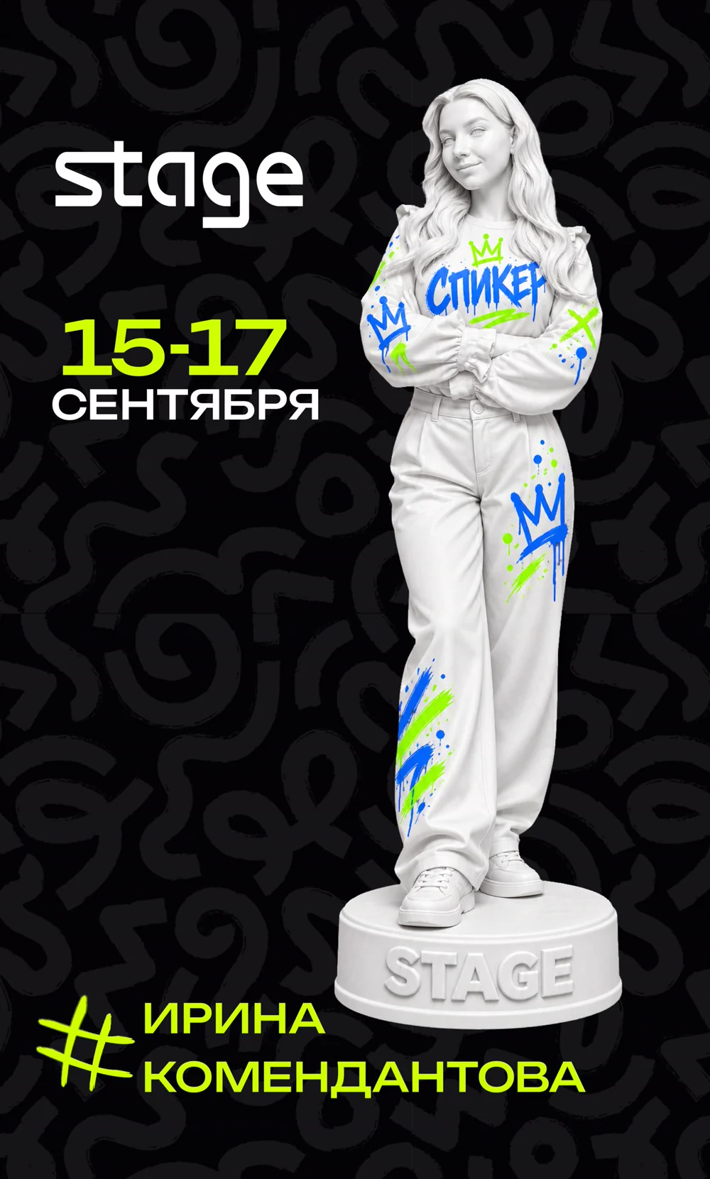
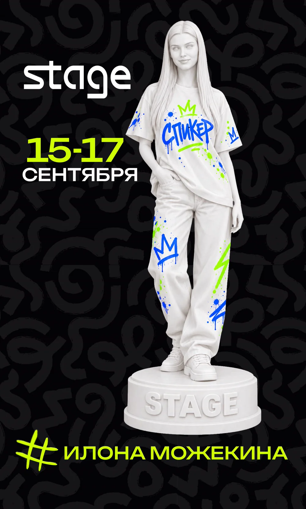
every speaker is a statue on a pedestal
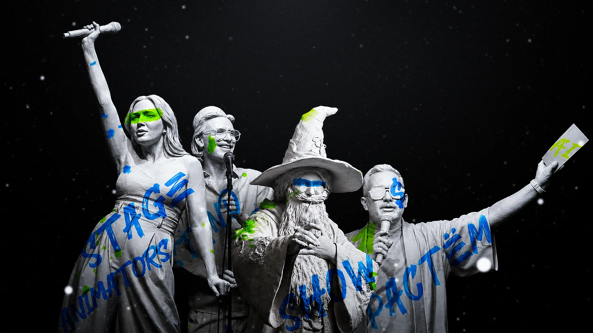
A plaster figure on a Stage pedestal, a “Speaker” graffiti, a crown and splashes in the brand lime green and blue turn a talk announcement into an art object people want to share.
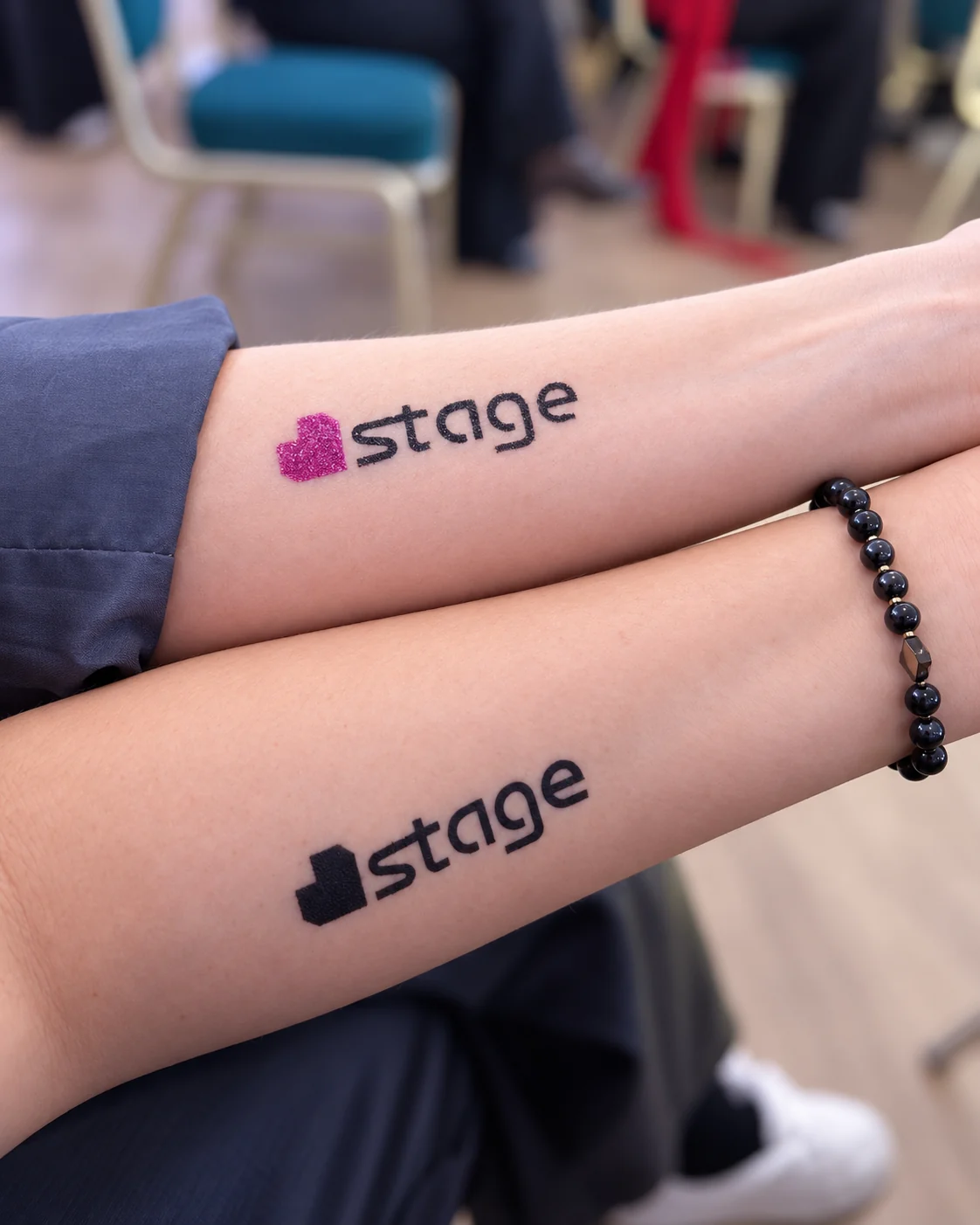
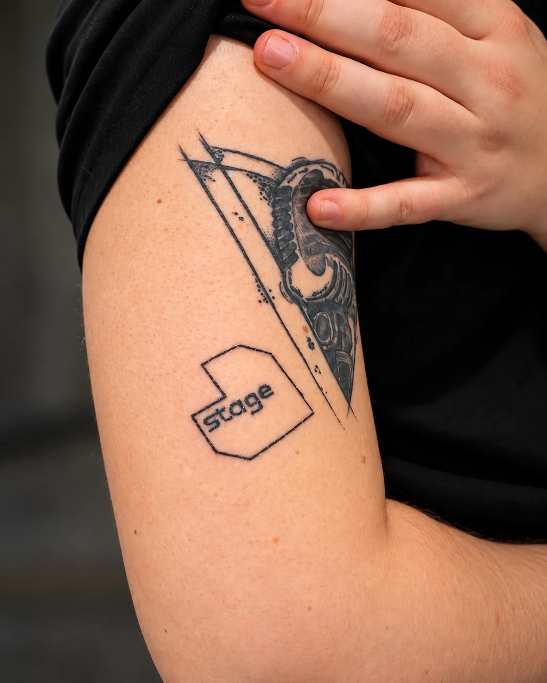
a mark people wear on their arms
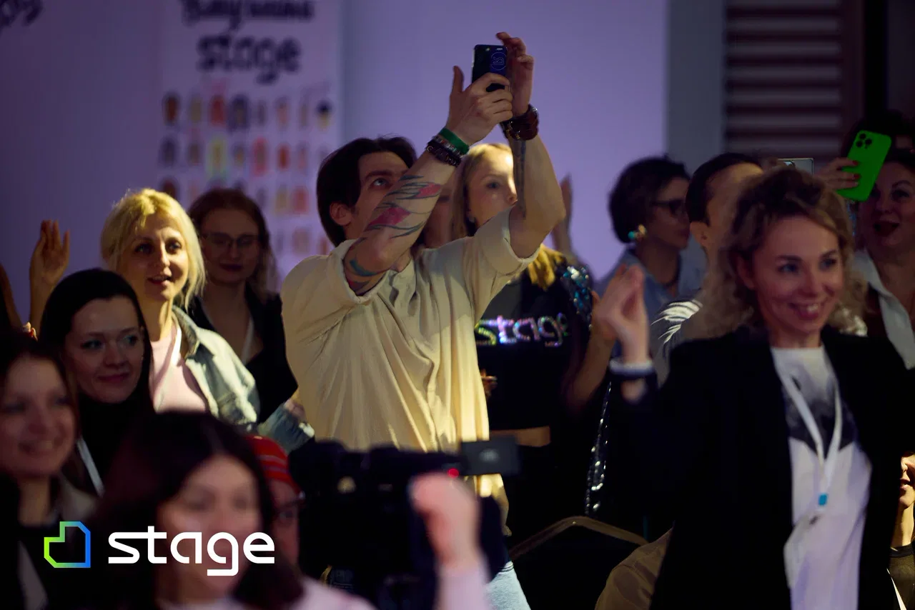
Participants liked the logo so much that they started drawing it on their arms right at the conference — and some had it tattooed for good.